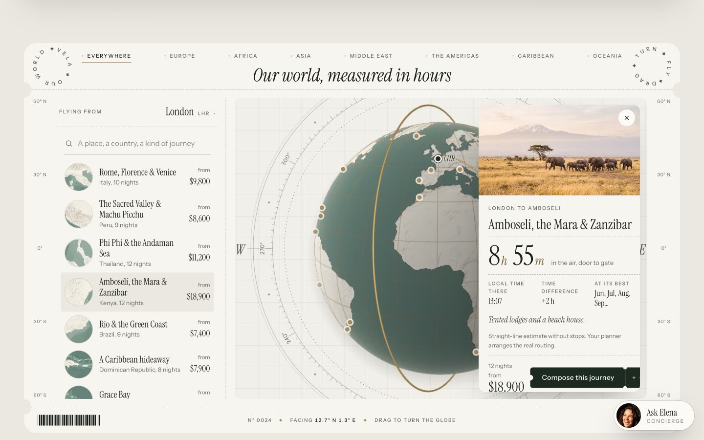
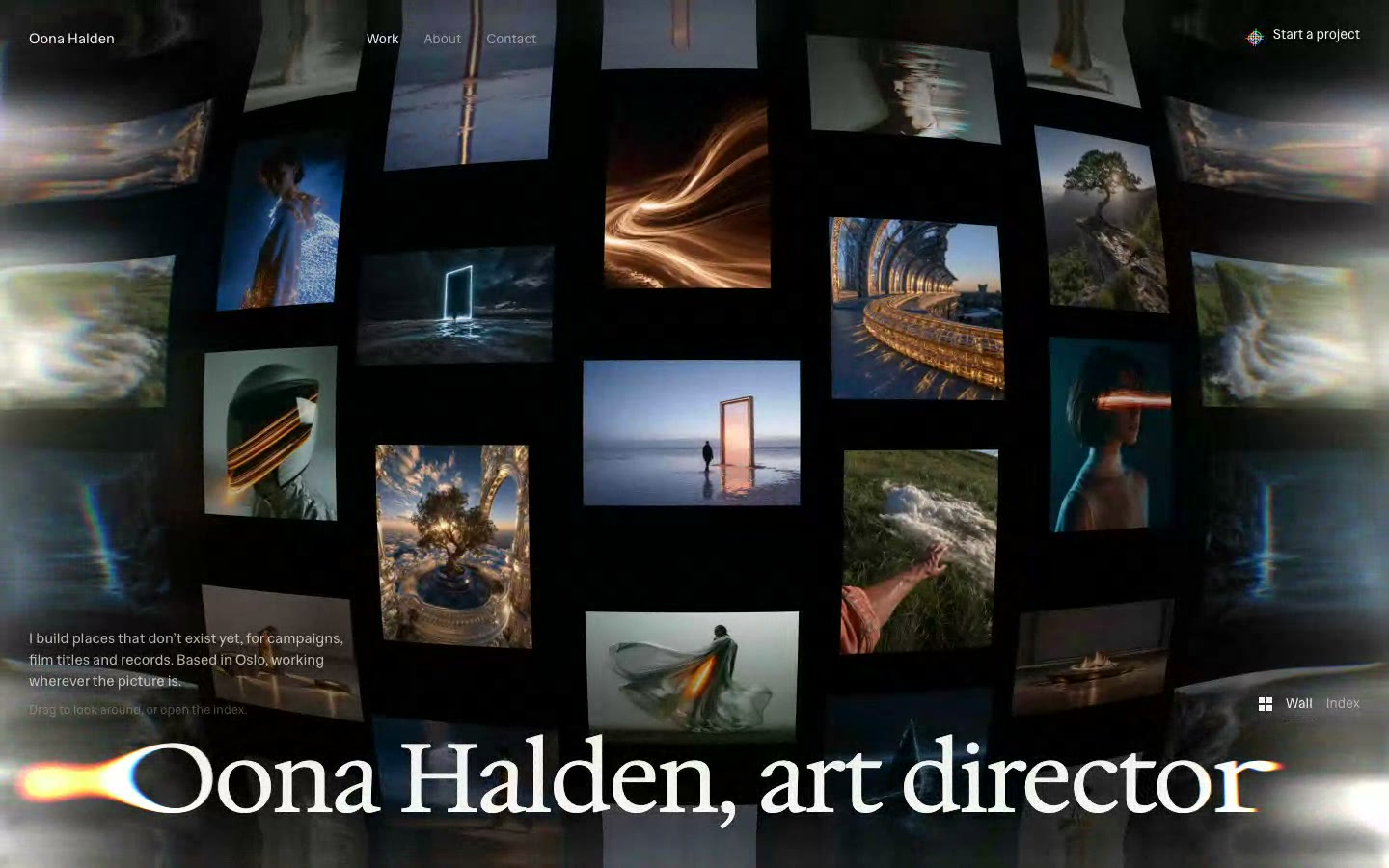
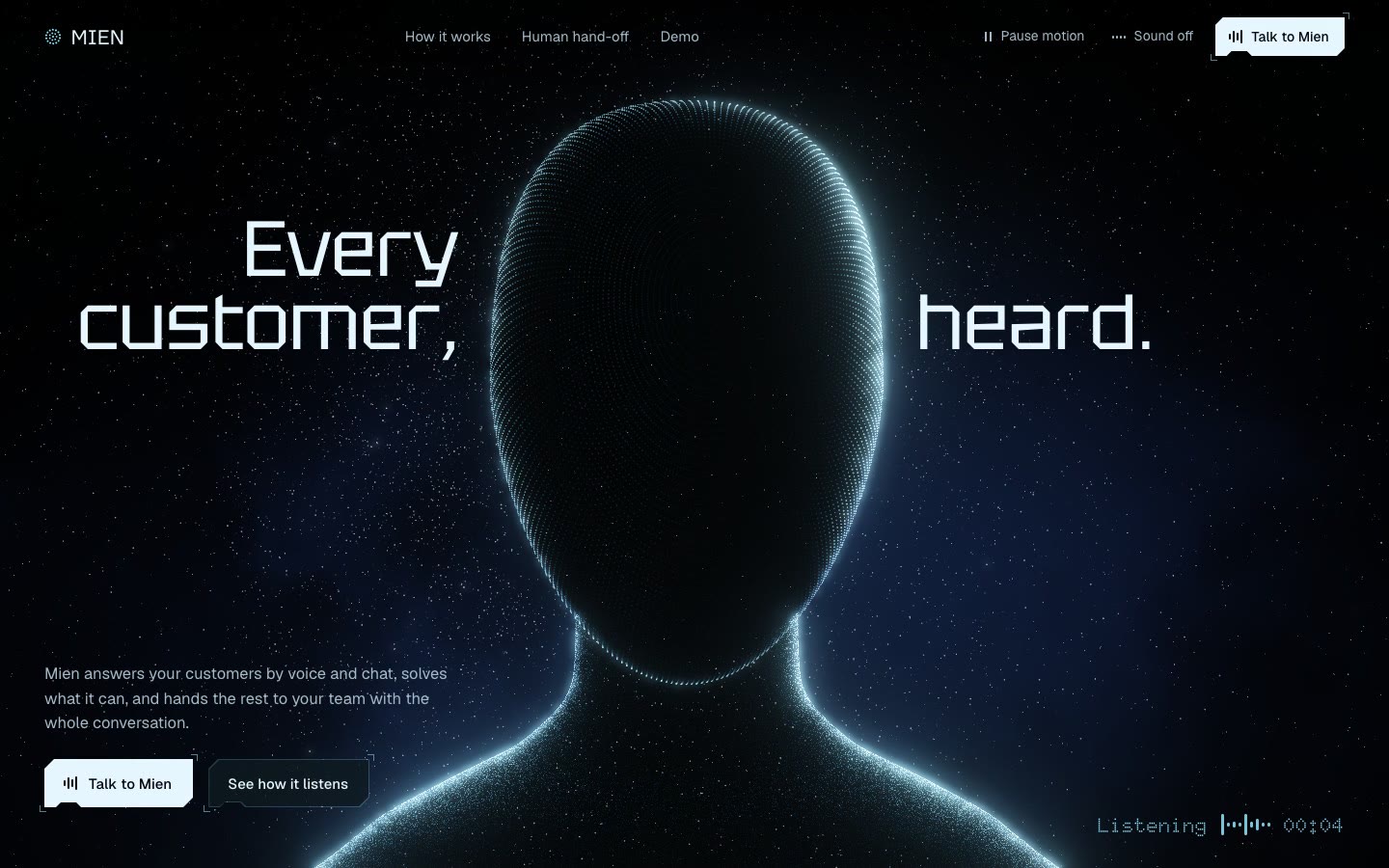
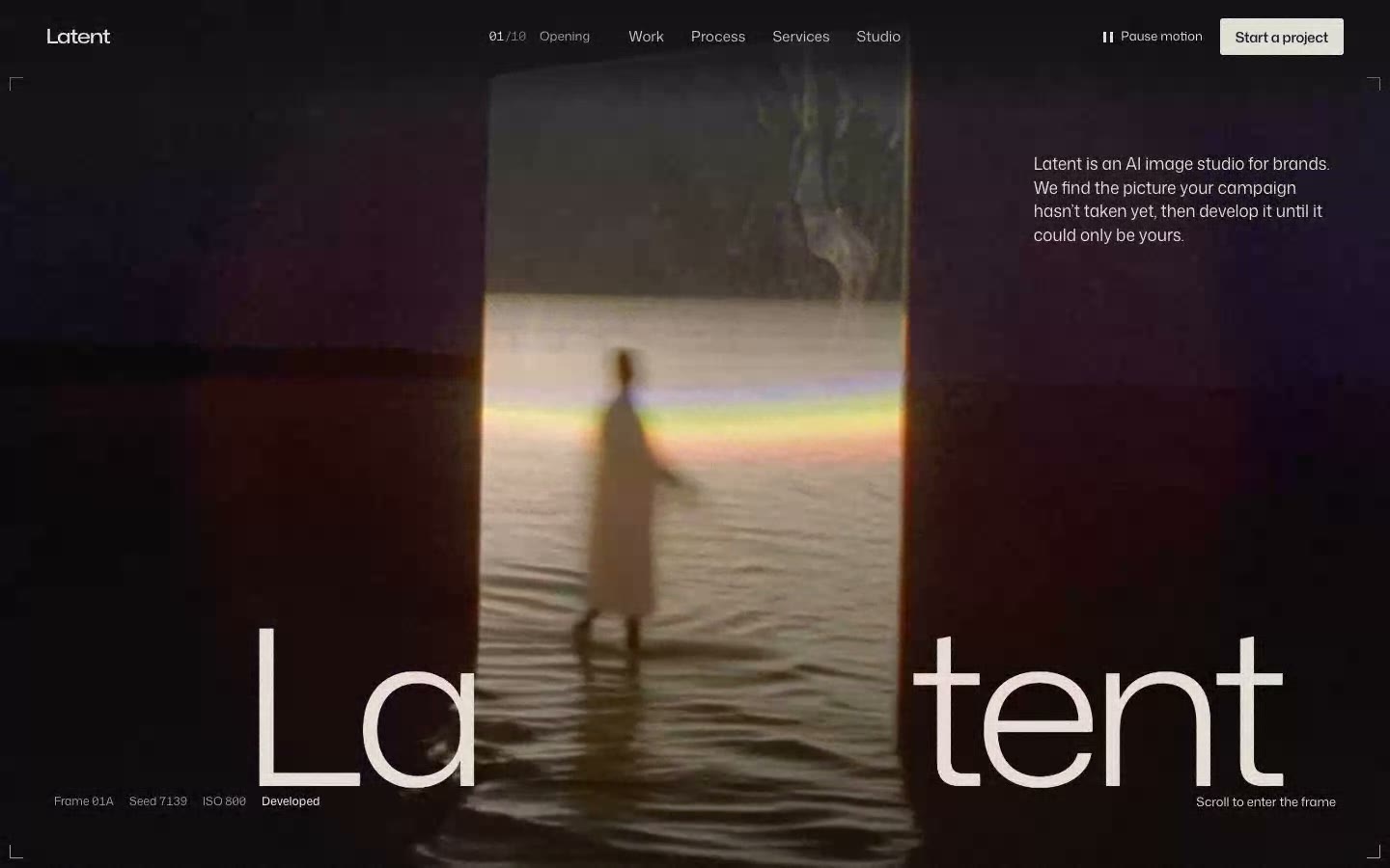





















FOLDSTATE
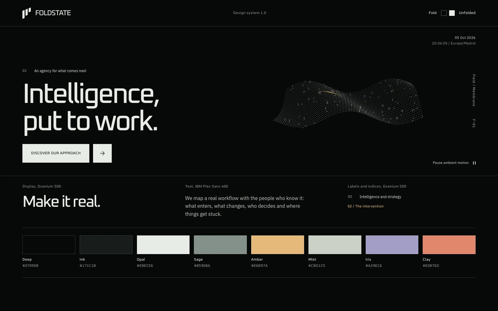
A calm, editorial system for AI-first studios and products, where every surface is a fold that can open to show how it was made.
Unlock at launch
Everything on the bench is live. Hover it, type in it, tab through it, or flip Fold.
About the system
- Built from
- FOLDSTATE website
- Components
- 35 in 7 groups, every state
- Typefaces
- Oxanium, IBM Plex Sans
- Fold
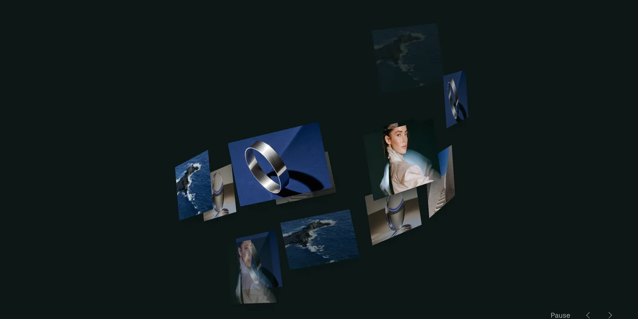
- Every surface is a stack of sheets. Unfold the interface and the layers fan out, the button's split opens, the glyph fields open from a cavity into a sheet and each trace of how something was made appears.
- Format
- HTML, CSS and JavaScript with no dependencies, plus DESIGN.md
- Version
- 1.0
- Deep
#070908 - Ink
#171C1B - Opal
#E8ECE6 - Sage
#85908A - Amber
#E6B97A - Mist
#CBD1C5 - Iris
#A29EC6 - Clay
#E0876D
In context
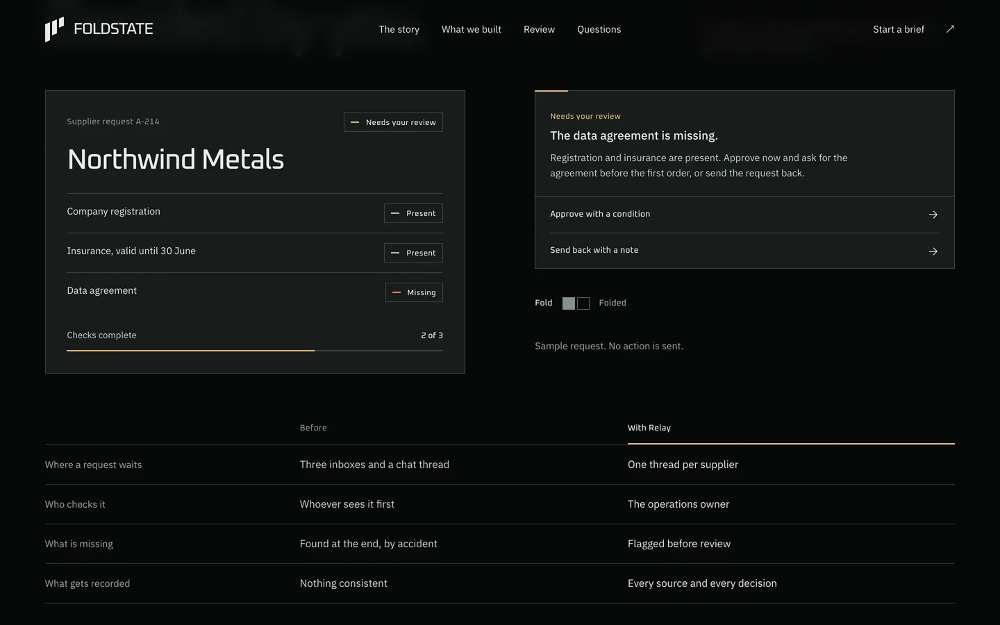
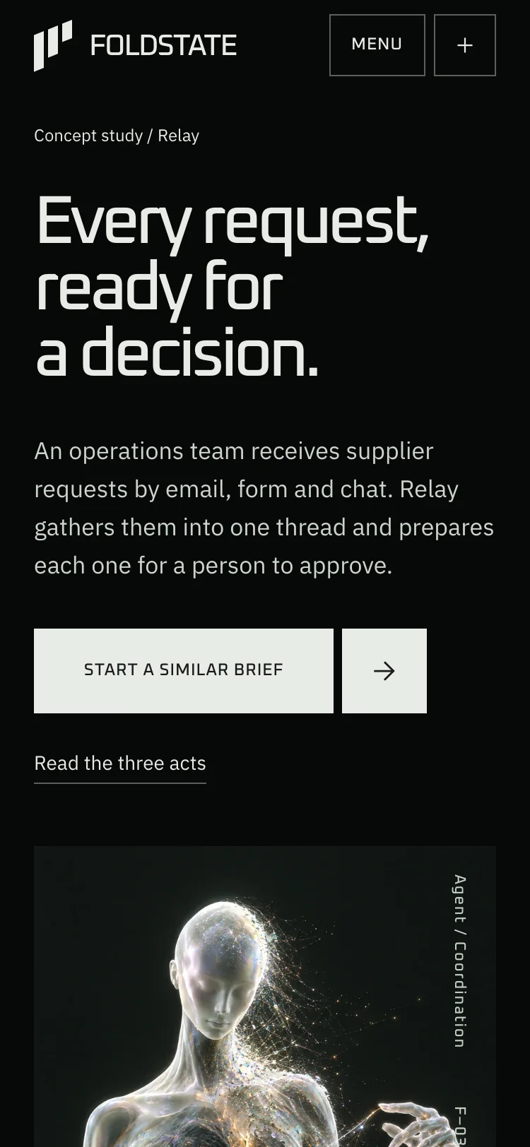
A case-study page built only from the kit. It ships as the starter, ready to rename.
In the kit
DESIGN.md- Rules for building with the system, written to hand to Claude, Lovable or a developer
tokens/tokens.json- Every colour, size, space and timing as named tokens
tokens/tokens.css- The same tokens as CSS variables, with daylight surfaces and the Fold state
css/foldstate.css- All components and their states
js/foldstate.js- Scramble labels, acts, tabs, dialogs, toasts, the live clock, glyph fields and Fold. No dependencies
components.html- Every component in every state, side by side
starter/index.html- A case-study page with a review demo and a brief form, built only from the system
assets/imagery/- Figure and Gesture renders of the agent at full resolution
LICENSE.md- Commercial use in your own and client projects
Building with an AI
Attach DESIGN.md
Add it to your conversation in Claude, Lovable or any AI builder.
Describe your page
In your own words, with your own brand and content.
Keep the code or port it
Link the token and component CSS, or ask for React. The rules hold either way.
Components
- Layout
- Frame and split, Section index, Chapter track, Coordinate, Live clock, Glyph field
- Actions
- Split button, Icon button, Text link, Action row, Pause control
- Input
- Line field, Select, Textarea, Checkbox, Radio, Switch, Toggle group
- Data
- Act stepper, Tabs, Stage figure, Table, Layer stack
- Status
- Tag, Checkpoint, Progress, Trace, Toast
- Content
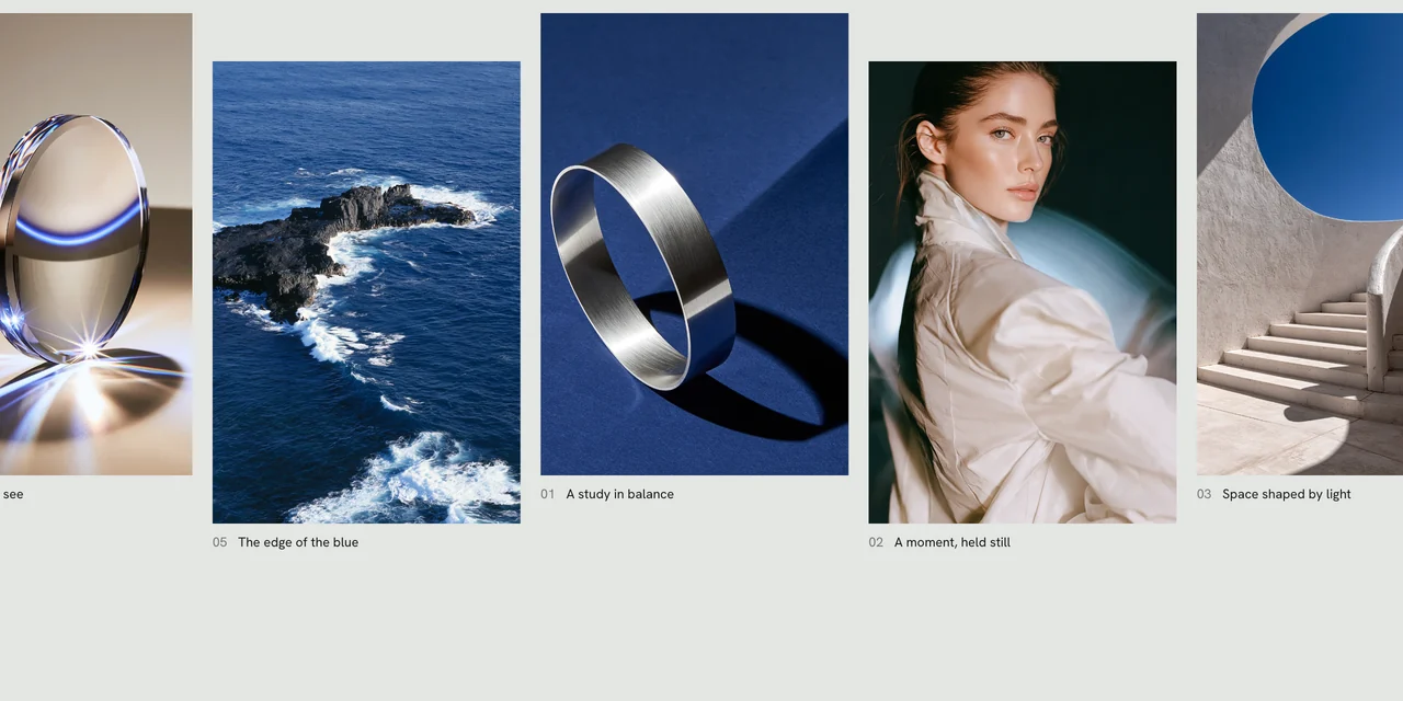
- Card, Sheet, Plate, Accordion
- Overlay and navigation
- Dialog, Navigation bar, Mobile menu
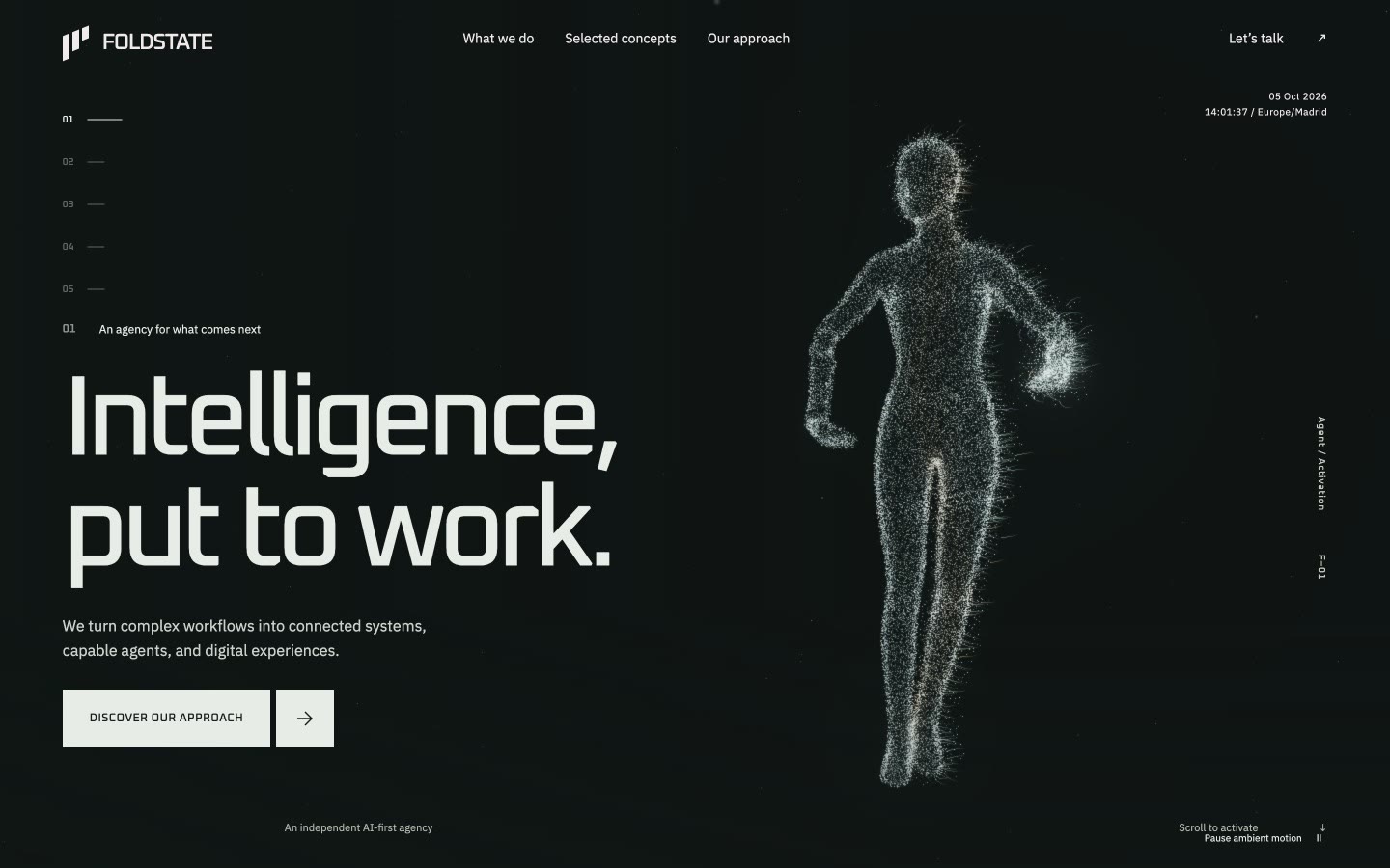 Built from FOLDSTATE
See the full website the system comes from.
Back to design systems