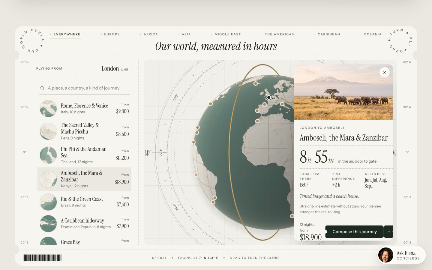
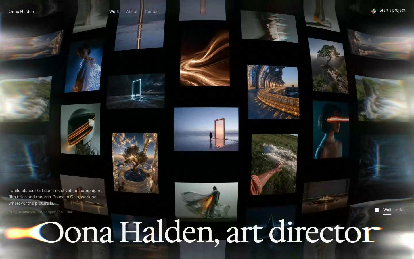
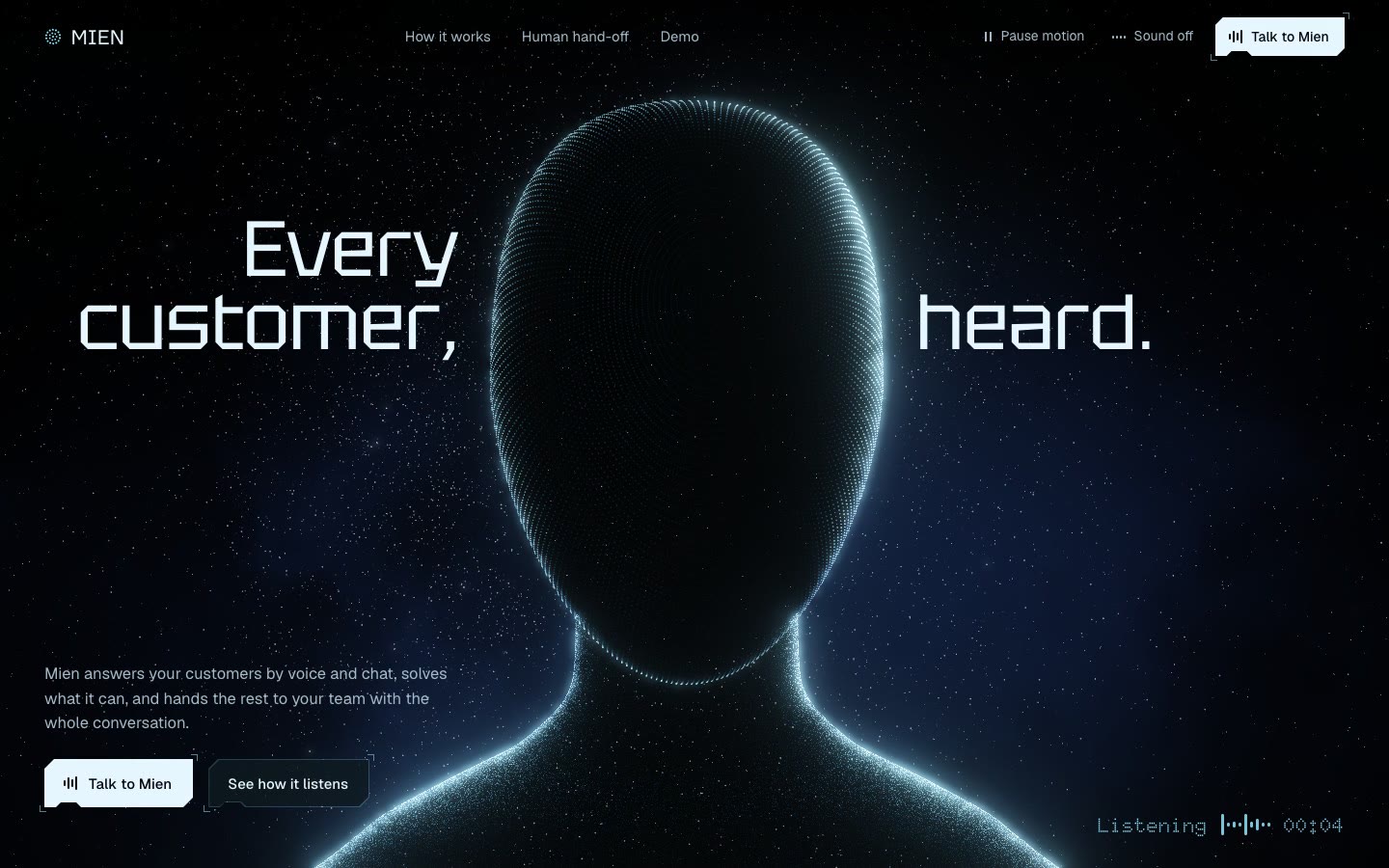
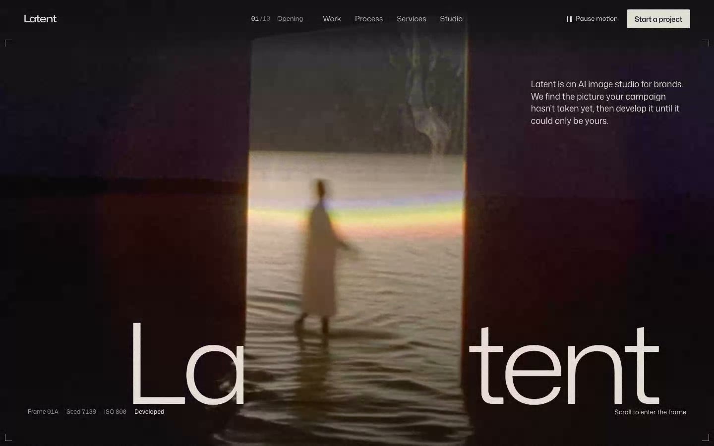





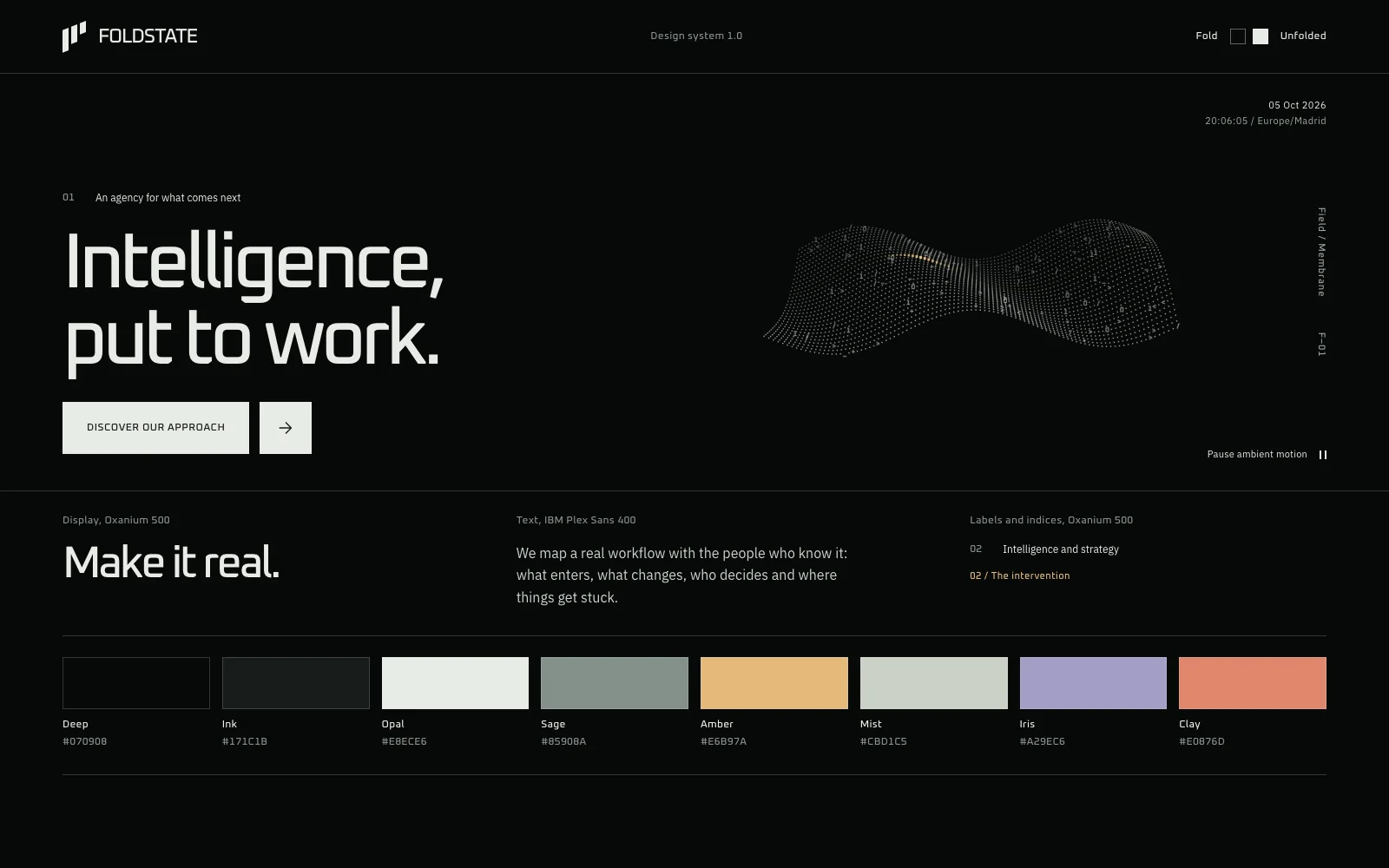
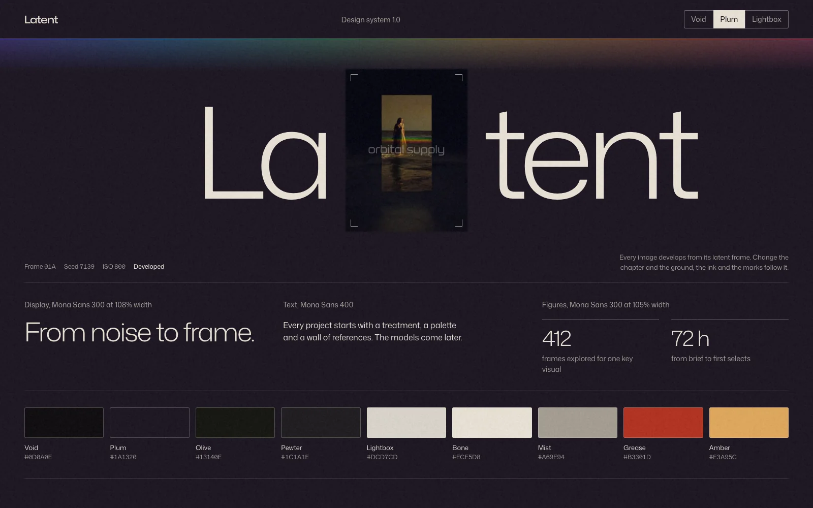
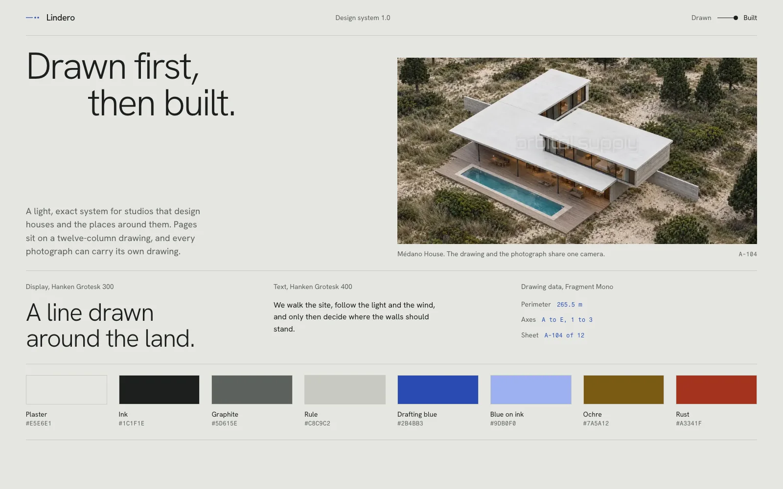
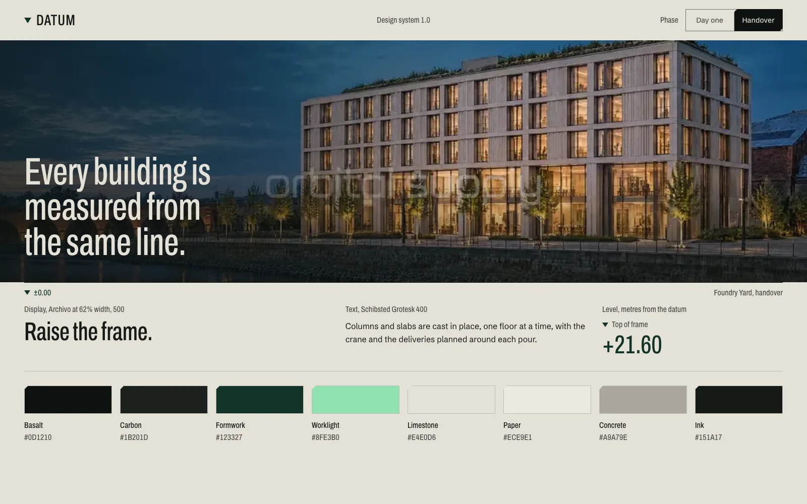














How to build a website with Claude Code that doesn't look generic
The process, skills and checks we use to build complete animated websites with Claude Code.
In short
To build a website with Claude Code that doesn't look generic, approve the art direction before any code exists, build the whole page in one pass and review it by looking at it. Skills help with taste and technique. The order of the work makes the bigger difference.
- Install one direction skill, the official GSAP skills and one critique skill, then stop.
- Ask for a one-page art direction board at final quality before Claude writes the site.
- Build the loader, every section, the closing, the footer and the mobile menu in the first pass.
- Check 375, 768, 1440 and 1920 pixels, the console, the keyboard and reduced motion.
- Keep your process and your taste in CLAUDE.md, so you only write them once.
What you need before you start
You need a Claude plan that includes Claude Code, Node.js 20 or later, Git and Chrome. That covers the design, the code, the skills and the review.
| What | What it’s for |
|---|---|
| Claude Code | Designs and writes the site. Use the desktop app’s Code tab or the terminal version |
| Node.js 20 or later | Installs skills with npx and runs React projects |
| Git | Saves versions, so you can always go back |
| Chrome | Shows the site and emulates phones in its developer tools |
The setup we use. On a Mac, Homebrew installs Node and Git in one command.
brew install node gitThe skills worth installing
Install one skill for direction, the official GSAP skills for motion and one skill for critique, and stop there. A skill is a folder of instructions that Claude loads when a task calls for it. Install it once with -g and every project can use it.
| Skill | What it does | When we load it |
|---|---|---|
frontend-design |
Visual direction, typography, composition | At the start of every site |
gsap-core, gsap-timeline, gsap-scrolltrigger |
Animation, sequences, anything tied to scroll | While building |
gsap-react |
GSAP inside React | When the site is React |
gsap-plugins, gsap-performance |
SplitText and Flip; fixing stutter | When the site needs them |
impeccable |
Critique and polish of a finished page | During the review |
animate |
Menus, buttons, panels and hovers | For small interactions |
Skills we use on our own builds. Their authors are Anthropic, GreenSock, Paul Bakaus and Emil Kowalski.
claude plugin install frontend-design@claude-plugins-official
npx skills add greensock/gsap-skills -g
npx skills add pbakaus/impeccable -g
npx skills add emilkowalski/skills -g
Open a new session after installing, so Claude can see them. Then keep two things in mind:
- Installed doesn’t mean used. In each phase, ask Claude to load the skill by name and to tell you which ones it loaded.
- Don’t stack style skills. Several skills with a fixed look override each other, and the page ends up looking like a template. A direction skill won’t save you alone either: sites built with one start to look alike, which is why the next step matters more.
Decide the direction before you build
Ask for a one-page art direction board and approve it before Claude writes the site, because no other step changes the result as much. Every section you don’t decide becomes the tool’s most common answer, and correcting a finished site costs far more than correcting one page.
Work through it in this order:
- The brief. What the business is, who it’s for, the one action you want, the feeling and any real constraints such as a logo or final copy. On a real business, don’t let it invent figures, testimonials or products.
- References. Two or three websites, two or three images and one or two examples in motion. Walk each site to the end, including its phone version. For each one, write down the principle you’re taking and what you’re leaving behind. Never reuse its images, copy or layout.
- The idea. One sentence: what the visitor sees, what changes as they move through the page and why. Then a table with one row per section: what it says, its composition, its asset, its motion and its phone version.
- The identity. Four to six colours with a job each, two typefaces at most and one way of moving. A slow cinematic site and a fast technical one both work. Mixing them doesn’t.
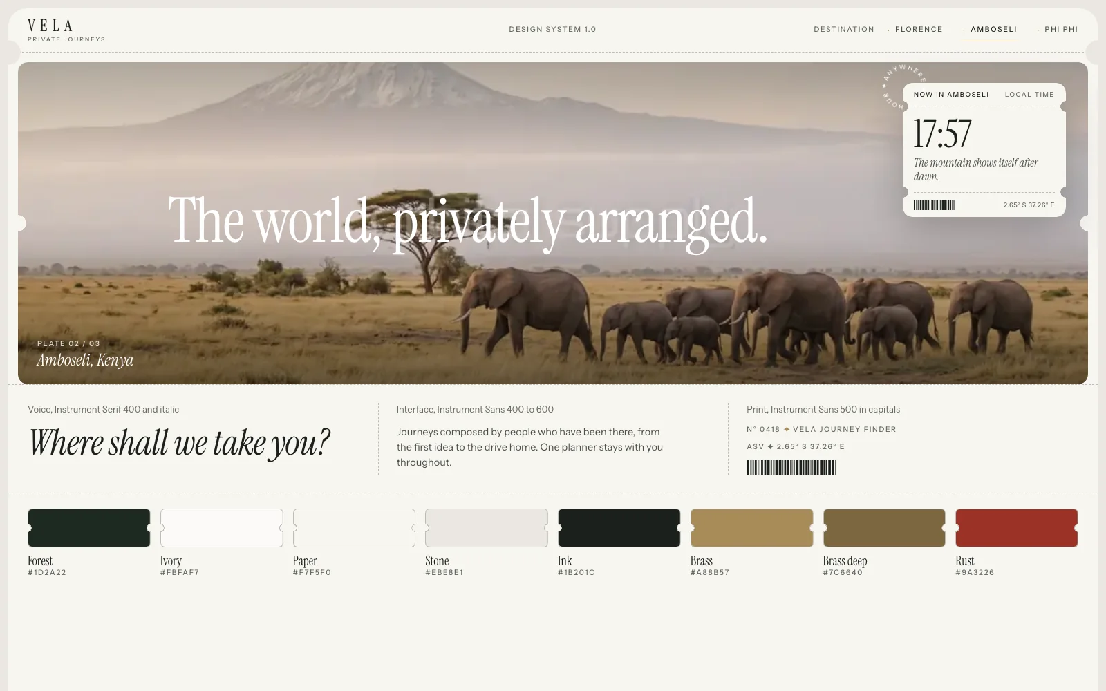
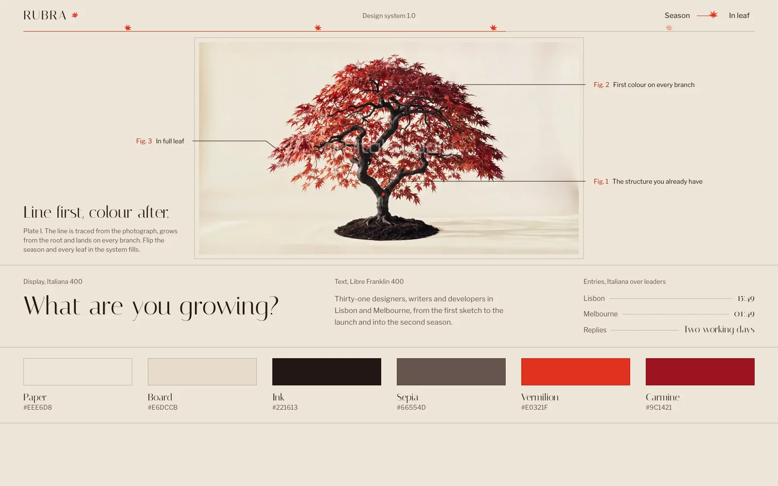
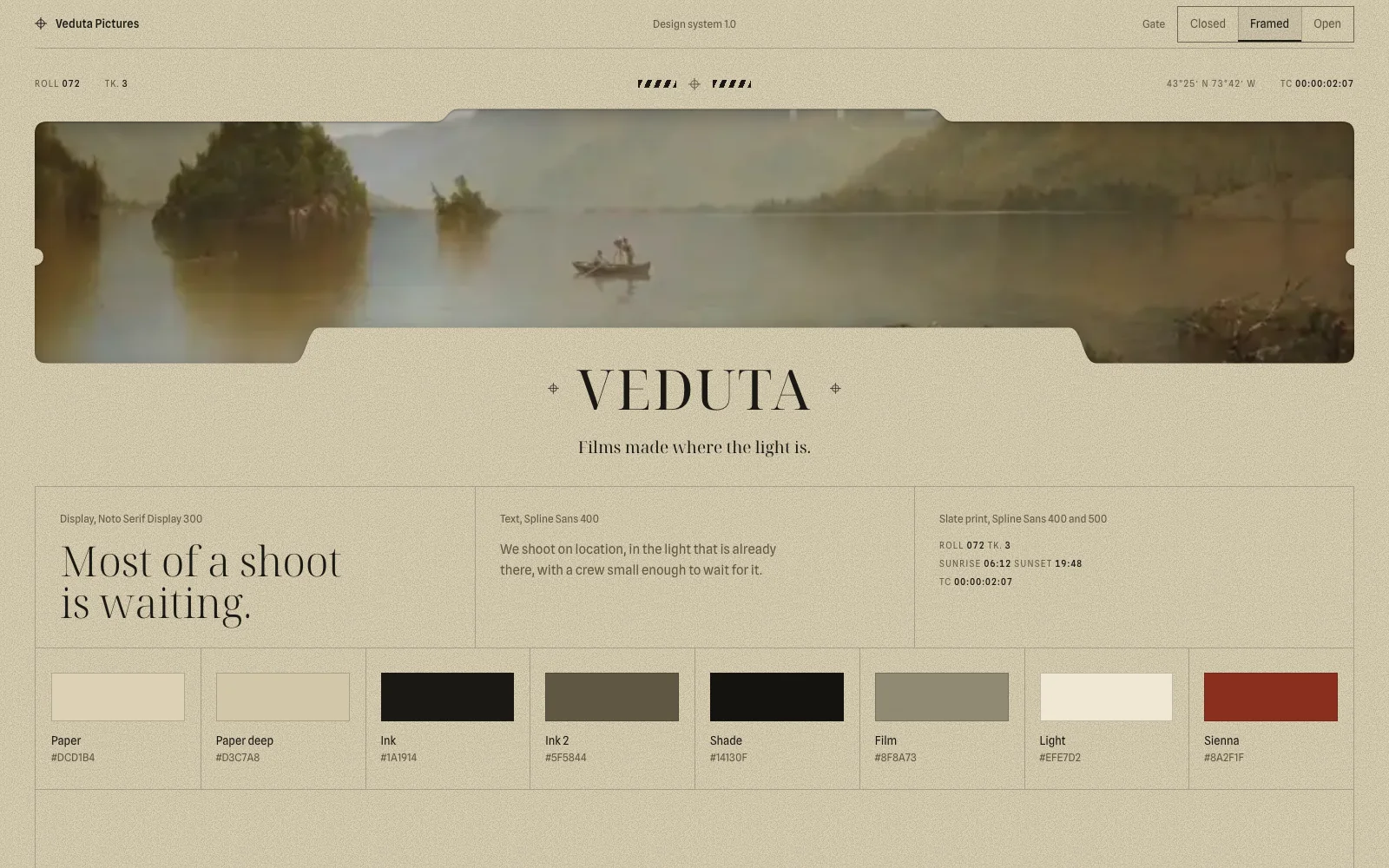
- The board. One HTML page holding a 16:9 mock-up of the hero at final quality, with real images and real type, plus the identity, the key inner section, the journey and the assets needed. No grey boxes.
Nothing gets generated or built until you approve the board. If the direction changes, redo it.
Build the whole page in one pass
Ask for the complete page in the first pass: loader, hero, every section, closing, footer and mobile menu. A hero alone looks finished and hides every problem that shows up further down. If you want the wording for that request, our guide on how to write a website prompt lists the six parts to include.
| Option | When to use it |
|---|---|
One index.html with GSAP from a CDN, at a fixed version |
Simple sites, with nothing to install |
| React, Vite, TypeScript, Tailwind CSS v4 and GSAP | Larger sites, or ones you’ll keep editing in another AI builder |
three, at a fixed version |
Anything with 3D or WebGL, with a visible fallback |
The two stacks in our catalogue, plus three.js when a piece needs it.
Sort out the assets the same way, starting small. Try two or three candidates for the hero inside the mock-up before you make the rest. Real photographs are best for real businesses, and licensed stock and your own generated images also work. A quick procedural 3D scene tends to look cheap, so ask for one frame at final quality before you commit to it. We compared the options in video, WebGL or CSS.
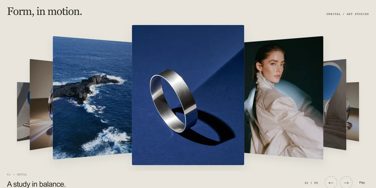
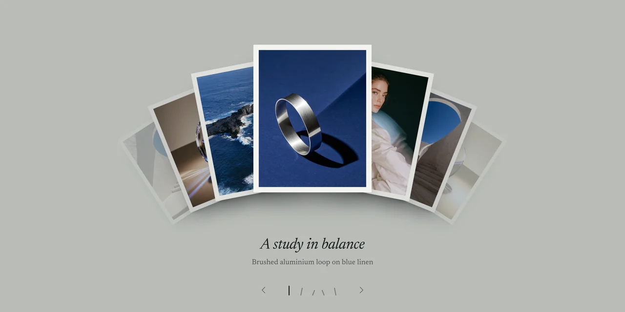
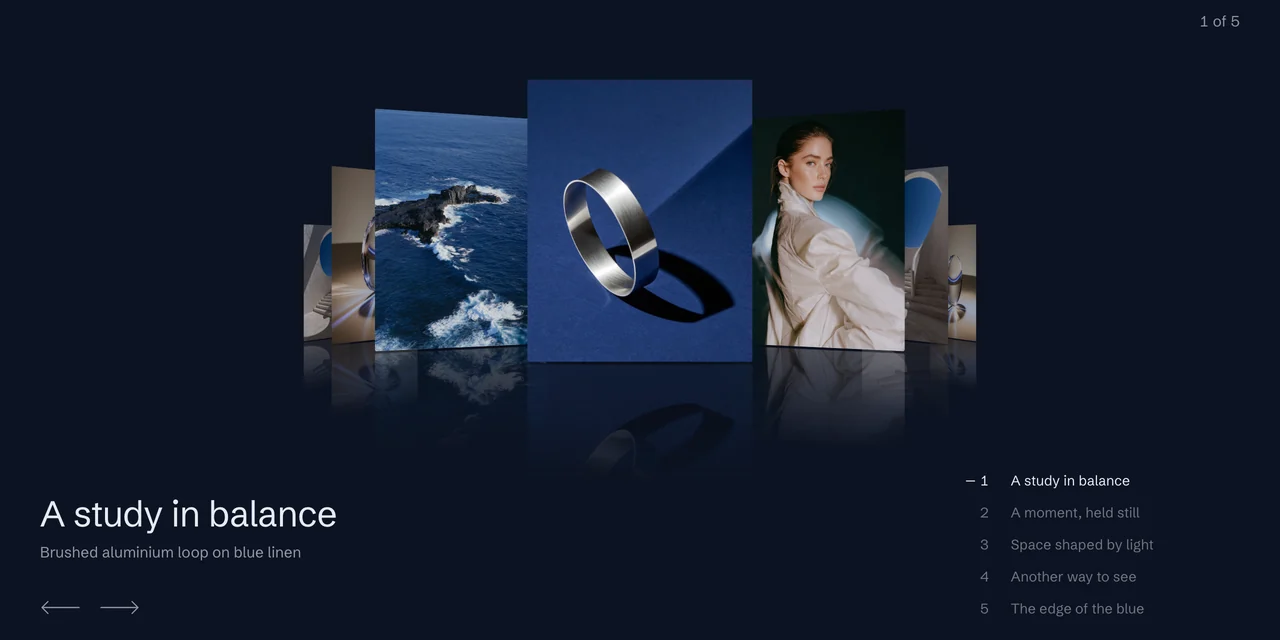
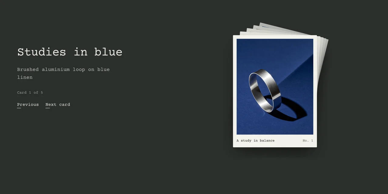
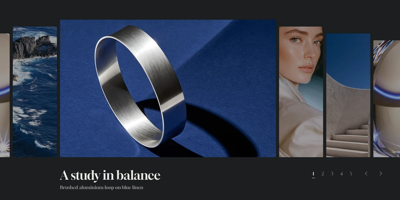
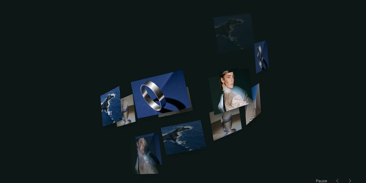
You also don’t have to write every effect from scratch. Our free tools export code for 3D image galleries, infinite image carousels and halftone and image textures, and you can paste it into the build.
Review it by looking at it
Passing tests says nothing about how a site looks, so review it in the browser on desktop and on a phone before you call it done. Ask Claude to load impeccable and criticise the whole page against the references and the idea. Group the corrections and apply them together.
Then run these checks:
- Screenshots at 375, 768, 1440 and 1920 pixels.
- A console with no errors.
- Tab through the page with the keyboard, with focus always visible.
- Reduced motion on, with the page still readable from top to bottom.
- Selects, sliders and dialogs open on a phone, none of them in the system’s default look.
- No text cut off inside masks, especially descenders and accents.
- A smooth first scroll on a normal laptop and on a real phone.
When something feels wrong, describe what you see instead of the fix you imagine: “the step from section two to three feels abrupt” works better than naming a technique. We wrote up the failures that keep coming back in nine bugs that break animated websites built with AI.
Keep your taste in a CLAUDE.md
Claude Code reads a CLAUDE.md file in the project folder at the start of each session, so you only have to write your process and your taste once. Start with something like this and add a line each time you correct the same thing twice:
# CLAUDE.md

### Process
1. Brief: business, audience, main action. Ask only what you can't infer.
   Never invent figures, testimonials or products.
2. References: walk each site to the end. For each, what we take and what
   we leave. No copied text, code, images or layouts.
3. Idea in one sentence, plus a table with one row per section.
4. Art direction board in board/direction.html, with a final-quality hero.
   Wait for my OK before generating assets or building.
5. Complete page in the first pass: loader, sections, closing, footer,
   mobile menu.
6. Review with impeccable on desktop and phone. Screenshots at
   375, 768, 1440 and 1920. Passing tests doesn't mean it looks good.

### Taste
- Full-screen scenes and one big line per scene. No hero plus three cards.
- Alternate a section with a photo background and a clean one.
- Keep an outer margin. Nothing touches the edge of the screen.
- One way of moving across the site. Animate transform and opacity.
- Lighter motion on phones, with no heavy pins.
- No native controls: selects, sliders and dialogs carry the site's design.
The taste section is the part that should become yours. Ours came from reviewing one site after another: full-screen wipes between sections felt heavy, jerky steps() hovers looked broken, and generated video for every state change felt forced. Yours will come from the same place, and writing it down is what stops you correcting it twice.
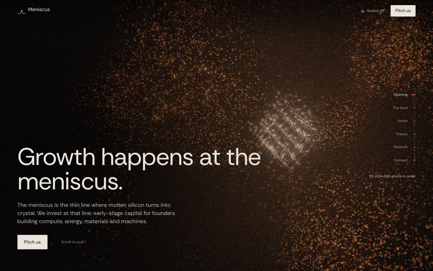
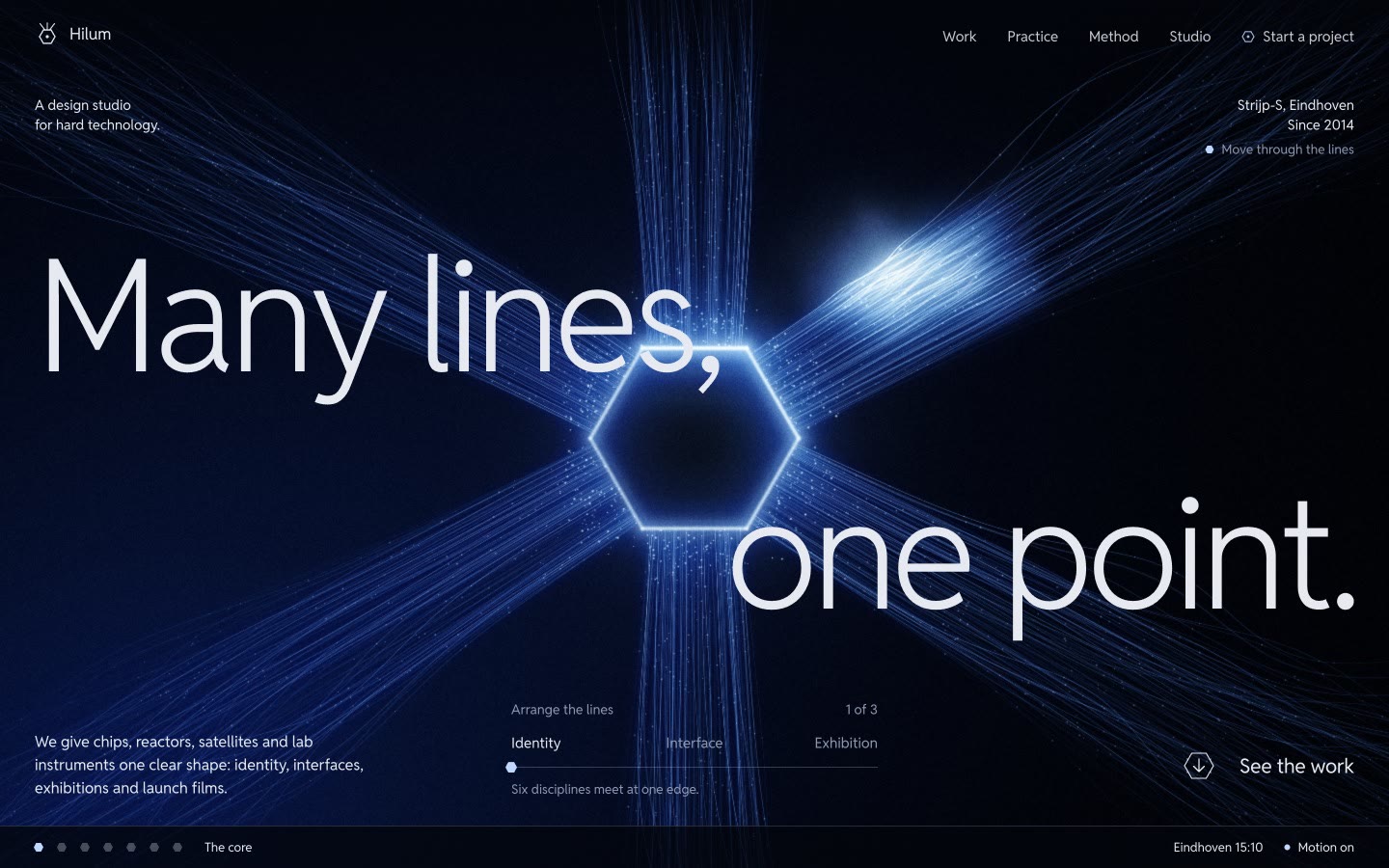
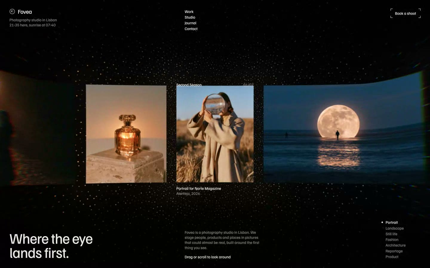
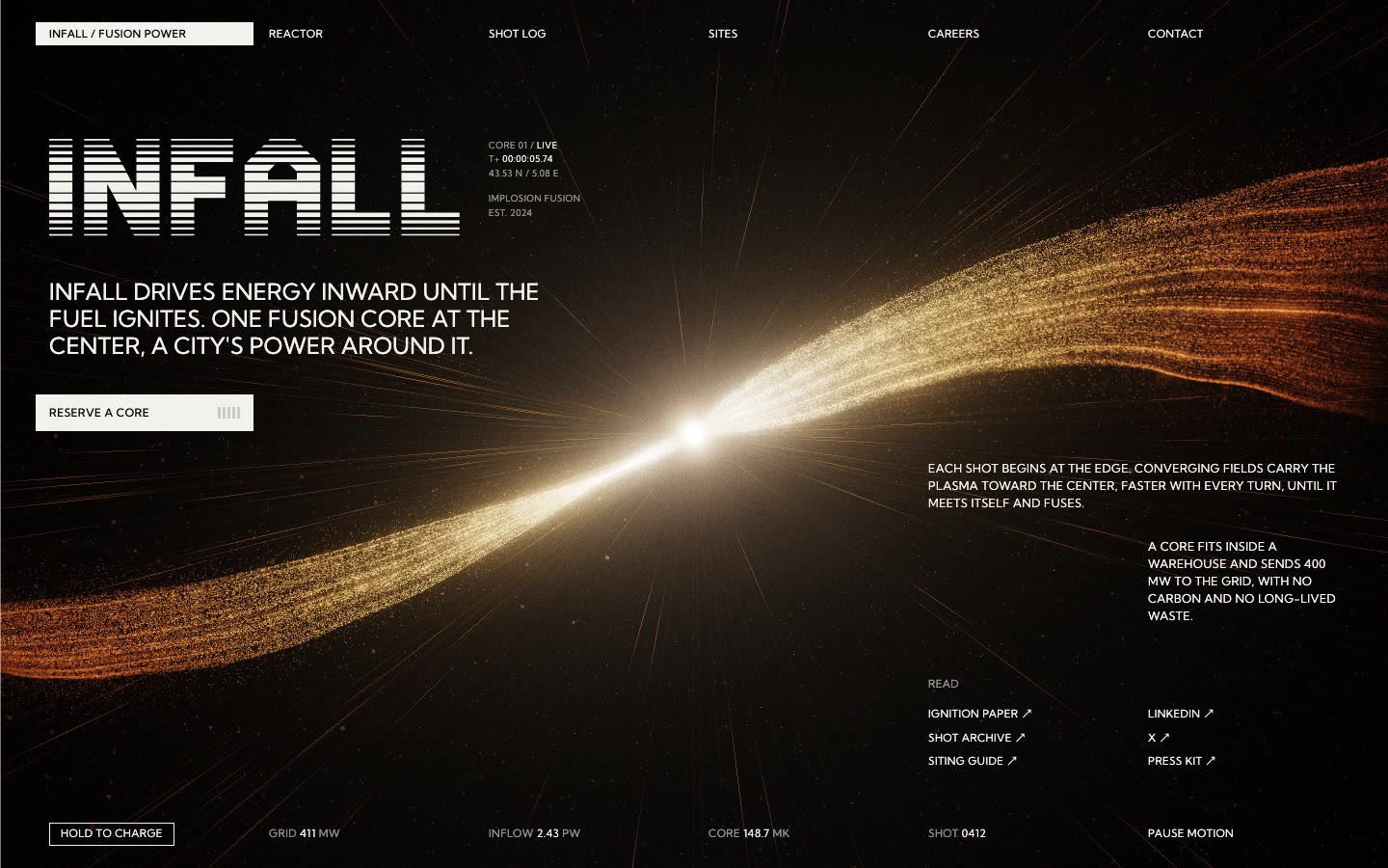
To see where this process ends up, browse our hero section examples and website templates. Each one comes with the prompt that rebuilds it.
Verdict. Spend your first hour on the board, not on the build. A site that started from an approved direction and got reviewed by eye will beat one made with more skills and no direction.
Questions
Short answers to what usually comes up next.
Can Claude Code build a whole website?
Yes. It can design, write and run a complete site, then open it in a browser and adjust what it sees. The result depends on what you ask for. A request for a landing page usually comes back as a hero and a row of cards, so ask for every section by name and approve the direction first.
Do I need to know how to code to build a website with Claude Code?
No, but you need to be able to judge the result and run a few commands. The desktop app has a Code tab, and Claude can explain any error it hits. Knowing some HTML and CSS helps you describe a problem precisely.
Which Claude Code skills are best for web design?
We use frontend-design for direction, the official GSAP skills for motion and impeccable for critique. Add others only for a specific job. Style skills with a fixed look tend to clash with each other when you stack them.
How do I stop a Claude Code website looking AI-generated?
Make the decisions the tool would otherwise default to. Choose the fonts, the palette, the composition of each section and one way of moving, and approve them on a board before building. Avoid hero-plus-three-cards layouts and Inter or Space Grotesk as the headline font.
Is GSAP free to use on a website?
Yes. GSAP and its plugins, including ScrollTrigger and SplitText, are free to use. Fix the version in your project or CDN link so a later release can't change how your site behaves.
Where should I host a website made with Claude Code?
Cloudflare Pages, Vercel and Netlify all have free plans for static sites. Connect the GitHub repository and each change publishes itself. Serve your images and videos from your own hosting, and never link to the server of the tool that generated them.
Skip the blank page
Start from a finished website.
Each template is a tested prompt with its code, assets and motion.Keep reading
All articles
How to write a website prompt that builds the whole site
The six parts a complete website prompt needs, measured across 62 prompts from our catalogue.
How to make a seamless video background for a website
Five steps to a hero loop with no visible cut, from the generation prompt to the final video tag.