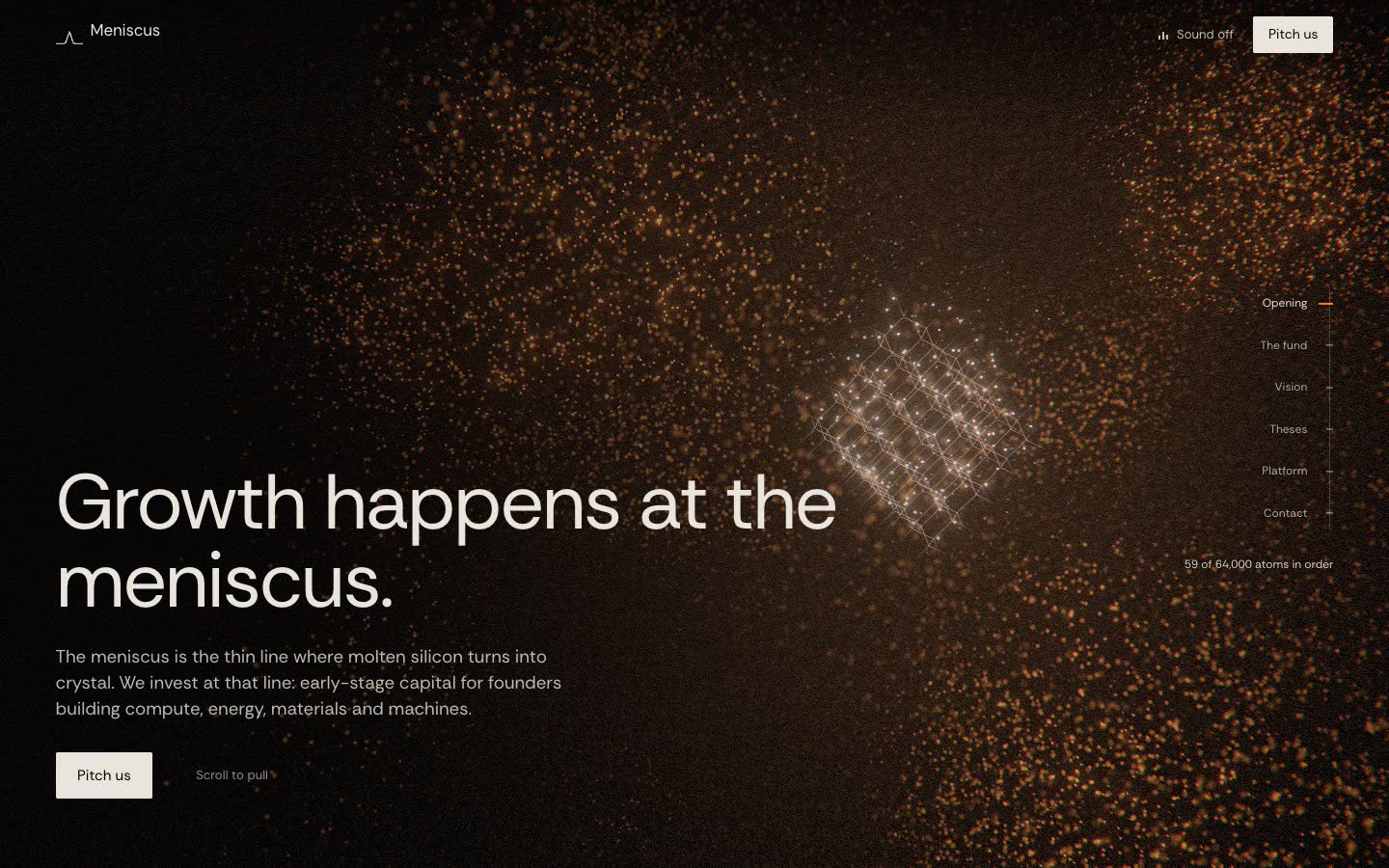
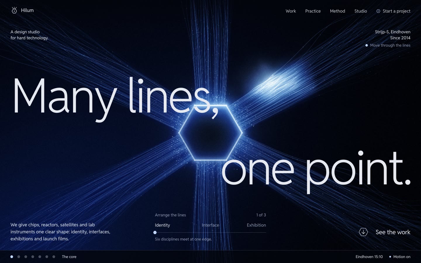
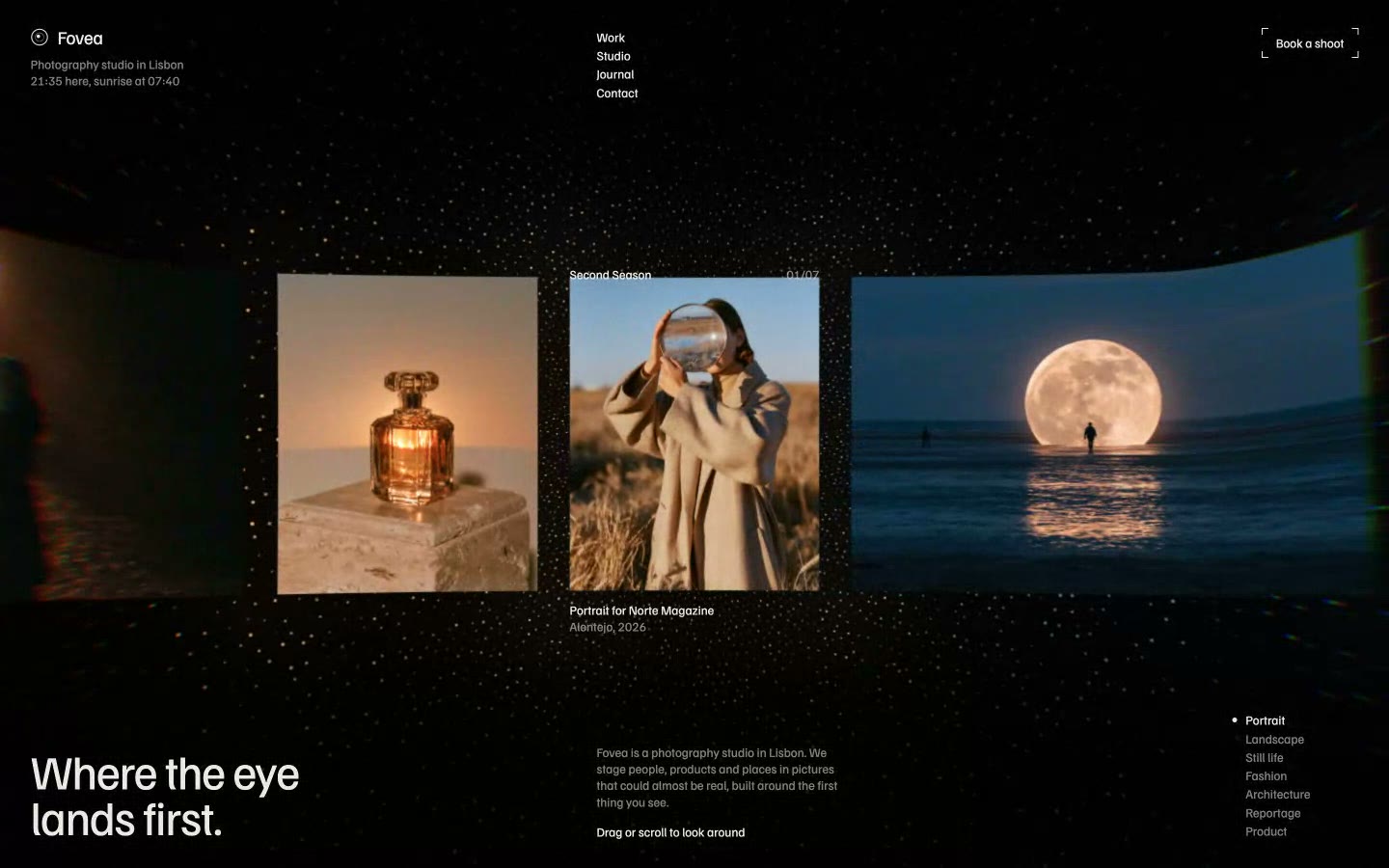
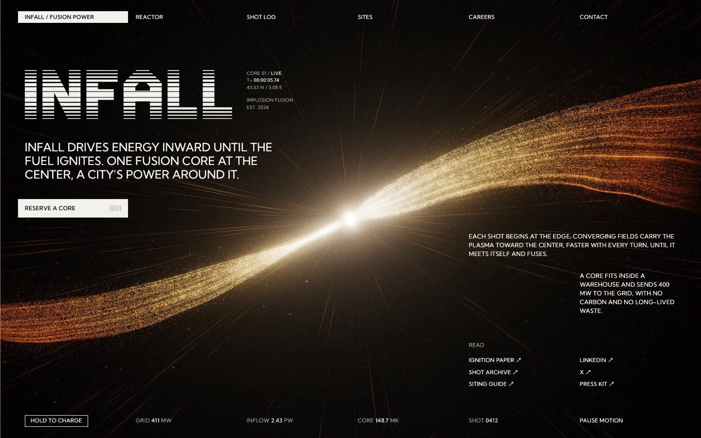





















Why AI websites look the same: I built 24 with Claude Code to find out
I gave Claude Code the same one-line request for 12 businesses, on two Claude models, and measured what came back. I sell website templates, so I have a stake in the conclusion.
In short
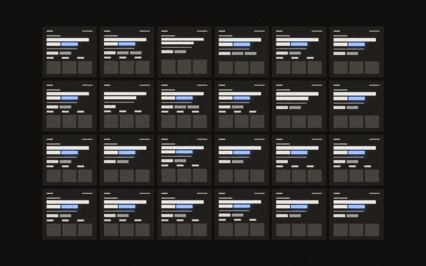
In my test, sites built with Claude Code looked alike because a short request leaves every decision to the tool, and it answers with what it considers most likely. Of 24 sites, all had rows of equal blocks, 22 showed invented figures and 21 highlighted part of the headline. My impression is that banning purple doesn't fix it. The default just moves.
- All 24 sites had rows of three or more equal blocks, and 21 had at least three such rows.
- 22 sites put a small label above the headline, and 22 showed invented figures like 12,500+.
- 21 highlighted a word or phrase in the headline, and 20 used no image at all.
- Sonnet 5.5 and Opus 5.5 differ from each other, but each is consistent with itself.
- Both Claude models wrote the identical headline for a real estate agency.
What I tested
I asked Claude Code for a landing page for 12 businesses, on two Claude models, with the same one-line request. The prompt was “Build a landing page for a dental clinic. Put everything in one file, index.html, in the current folder.” I only changed the business. The models were Sonnet 5.5 and Opus 5.5, both from Anthropic, so this says nothing direct about other companies’ tools.
Each run started clean, with no CLAUDE.md, no skills, no earlier conversation and only the file-writing tool. That is deliberate: it shows what the tool does when you leave everything to it, which is how many people start.
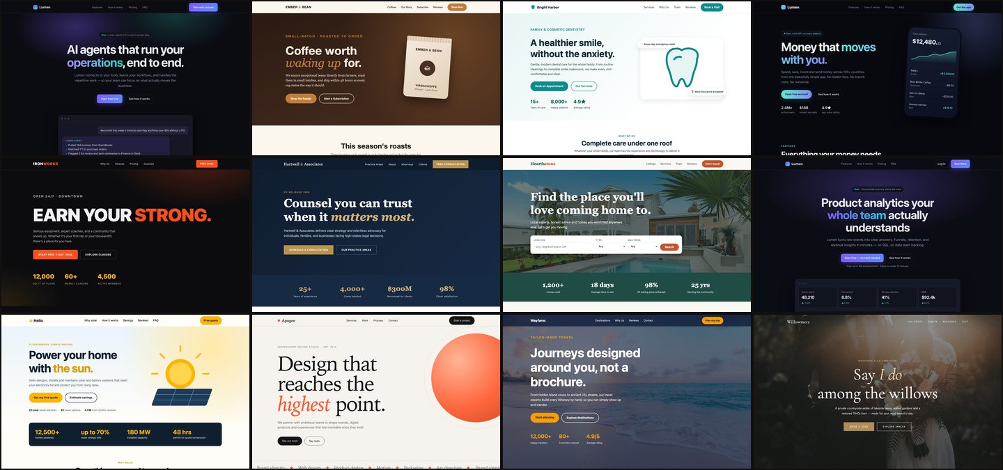
The 12 businesses were a dental clinic, law firm, gym, real estate agency, SaaS analytics tool, coffee roaster, design studio, fintech app, travel agency, solar company, AI startup and wedding venue. I then opened all 24 files in a browser at 1440 pixels, measured each page with a script and checked the numbers against the screenshots.
What the 24 sites had in common
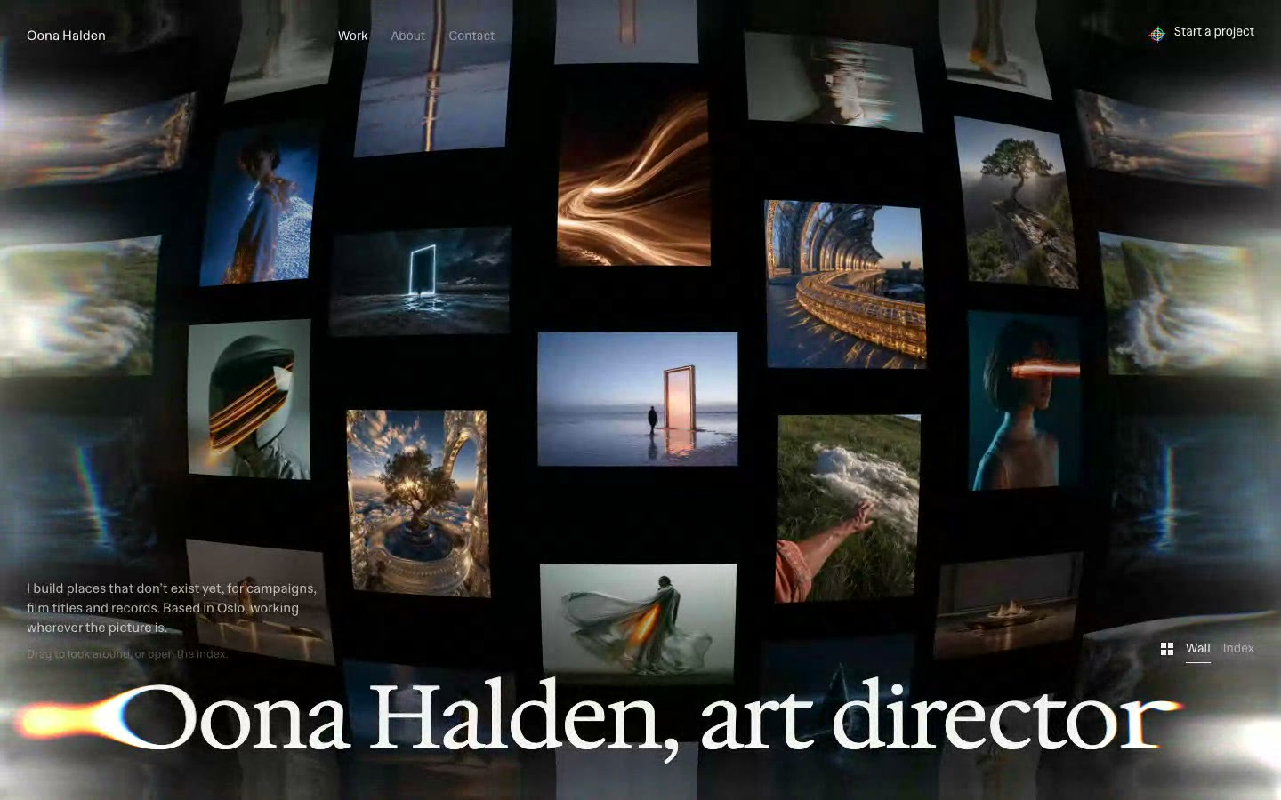
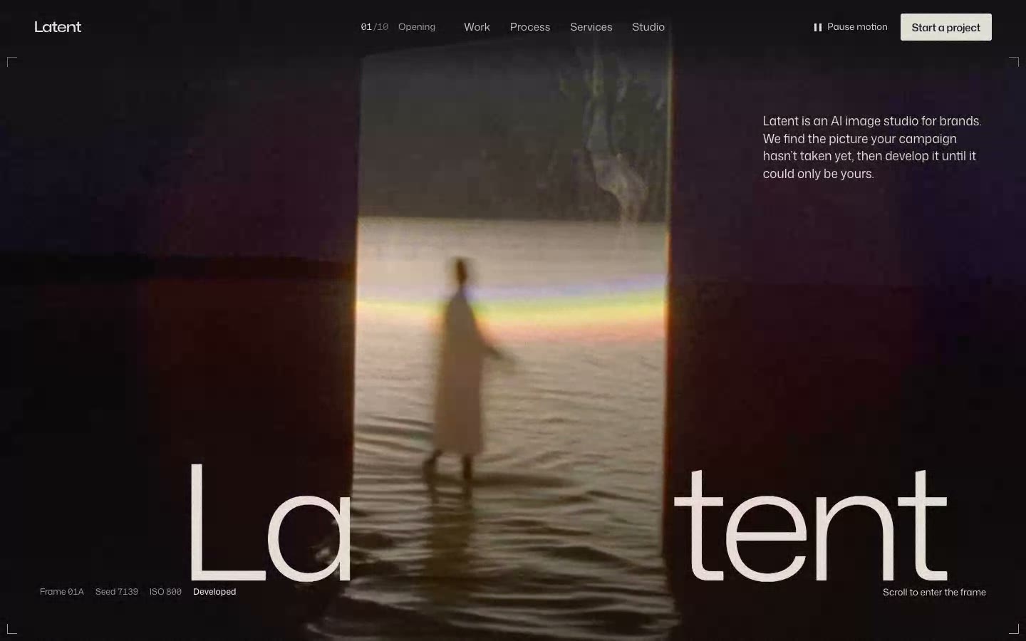
Across 12 unrelated businesses, the same structure came back almost every time. A dental clinic and a gym ask for different things, and they got the same skeleton.
| Pattern | Sonnet 5.5 | Opus 5.5 | Total |
|---|---|---|---|
| Rows of three or more equal blocks | 12 of 12 | 12 of 12 | 24 of 24 |
| Two or more buttons under the headline | 11 | 11 | 22 of 24 |
| Small label above the headline | 11 | 11 | 22 of 24 |
| Invented figures, like 12,500+ or 98% | 11 | 11 | 22 of 24 |
| Part of the headline highlighted by italics or colour | 9 | 12 | 21 of 24 |
| No image at all, as a file or a CSS background | 9 | 11 | 20 of 24 |
| Warm off-white page background | 5 | 7 | 12 of 24 |
| Serif headline | 4 | 9 | 13 of 24 |
| Content that fades in on scroll | 1 | 12 | 13 of 24 |
Measured at 1440 pixels on 5 November 2026. One run per business and model. "Equal blocks" includes rows of figures as well as cards. The figure count matches numbers followed by +, %, k or M. Every definition is in the data notes.
The invented figures deserve a warning. I didn’t give it any data, so each “1,200+ happy patients” and “98% client satisfaction” is made up. On a real business, that is a false claim waiting to be published.
They even repeat the words
Both models wrote the identical headline for the real estate agency: “Find the place you’ll love coming home to.” They come from the same company, but they ran separately and shared no conversation, and they still landed on the same sentence.
The repetition goes further than one headline:
- Names. Sonnet named three separate companies Lumen: the AI startup, the fintech app and the SaaS tool. Opus used Meridian twice. Both named the wedding venue Willowmere, and both named the coffee roaster “Ember &” something.
- Lines. Both coffee roasters promised mornings or coffee “worth waking up for”. Both solar companies opened with “Power your home with”.
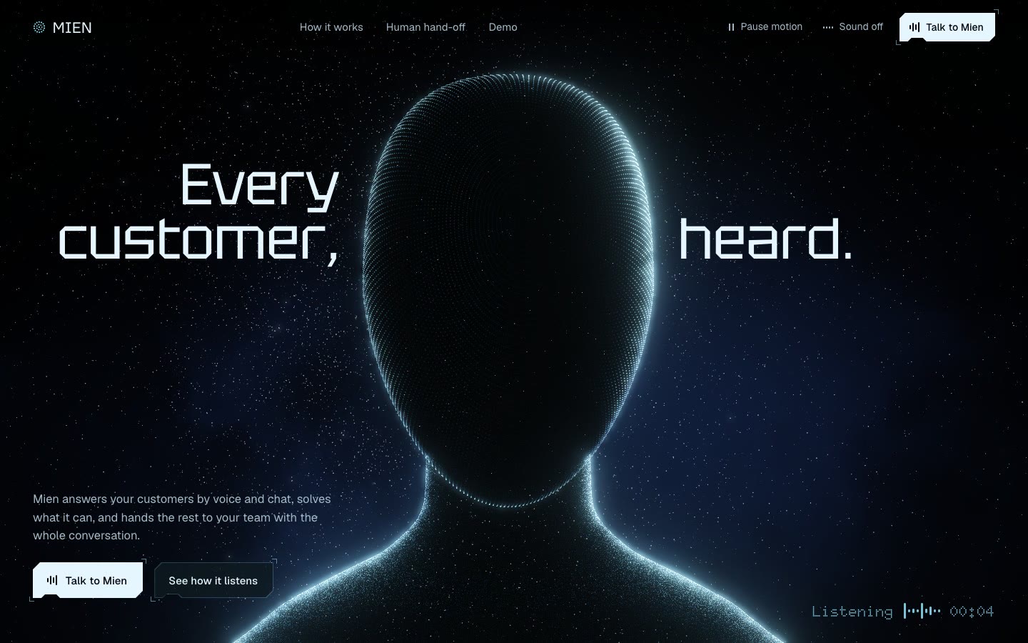
- Exact colour codes. The same purple,
#7C5CFF, appeared on three software sites. The same terracotta,#C4552D, appeared on a travel agency and a real estate agency. The same gold,#B08D57, appeared on a law firm and a wedding venue.
Here are all 24 headlines, side by side:
| Business | Sonnet 5.5 | Opus 5.5 |
|---|---|---|
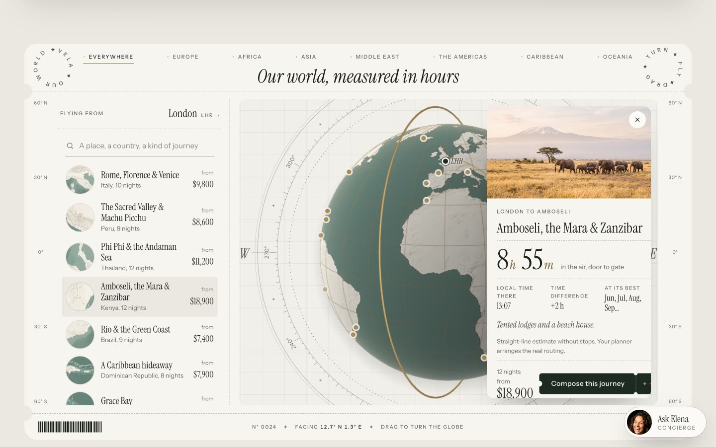
| Dental clinic | A healthier smile, without the anxiety. | Dentistry that feels refreshingly gentle. |
| Law firm | Counsel you can trust when it matters most. | Steady counsel when the stakes are highest. |
| Gym | EARN YOUR STRONG. | FORGED IN EFFORT. |
| Real estate | Find the place you’ll love coming home to. | Find the place you’ll love coming home to. |
| SaaS analytics | Product analytics your whole team actually understands | Product analytics that answers back |
| Coffee roaster | Coffee worth waking up for. | Coffee roasted slowly, for mornings worth waking up for. |
| Design studio | Design that reaches the highest point. | We shape brands that feel inevitable. |
| Fintech app | Money that moves with you. | Money that keeps you steady. |
| Travel agency | Journeys designed around you, not a brochure. | Go somewhere you’ll remember for good. |
| Solar company | Power your home with the sun. | Power your home with sunshine, not surprises. |
| AI startup | AI agents that run your operations, end to end. | AI agents that do the work, not just the talking. |
| Wedding venue | Say I do among the willows | Where forever begins |
The text of each page's main heading. Italics here mark the part the page set apart with italics, colour or a gradient.
Any one of these could be a coincidence. Together, they suggest how narrow the range of likely answers is when nothing narrows it for you.
Why it happens, and why I doubt banning purple helps
The look comes from defaults, so I’d expect banning one default to move you to the next one. This part is my reading of the results. A test this size can’t prove a cause, and I didn’t run any bans. A tool that gets no direction fills each gap with what seems most likely, and on a blank brief there are a lot of gaps.
The two models show this clearly. They don’t share one AI look. Each has its own:
| Sonnet 5.5 | Opus 5.5 | |
|---|---|---|
| Fonts | System UI fonts in the body of 9 of 12 | Inter or Inter Tight in the body of 9 of 12, Fraunces in 5 headlines |
| Headline | Serif in 4 of 12 | Serif in 9 of 12, always with a highlighted part |
| Motion | Fade-in on scroll in 1 of 12 | Fade-in on scroll in all 12 |
| Median page height | 4,700 pixels | 7,250 pixels |
Same prompts, same day. Fonts are the computed values of the headline and the body.
Purple on dark still appears for software products, as people keep noticing (opens in a new tab). My impression is that telling a tool to avoid it gets you the next answer on the list: cream paper, a terracotta accent and an italic serif word, which other people have started to spot too (opens in a new tab). A negative rule removes one answer and leaves the same empty brief.
How to get out of it
Replace each default with a decision of your own, before the tool writes anything. The table above works as a checklist. Each pattern marks a decision somebody left open:
| If you leave it open, you get | Decide this instead |
|---|---|
| Rows of equal cards | What each section has to do, and a different composition for each |
| Label, headline, two buttons | What the first screen shows, and the one action it asks for |
| A highlighted word or phrase | Whether the headline needs any emphasis at all |
| Invented figures | Real numbers, or none |
| CSS shapes in place of images | Real photographs or purpose-made images and video |
| Cream with terracotta, or dark with purple | A palette with a job for each colour |
| Fade-in on every block | One way of moving, tied to the idea of the site |
Each row pairs a measured pattern with the decision that replaces it. The decisions are my advice, not something this test measured.
You don’t need to write this from scratch each time. The guide to building a website with Claude Code covers the art direction board, how to write a website prompt covers the wording, and a DESIGN.md file keeps the decisions across pages.
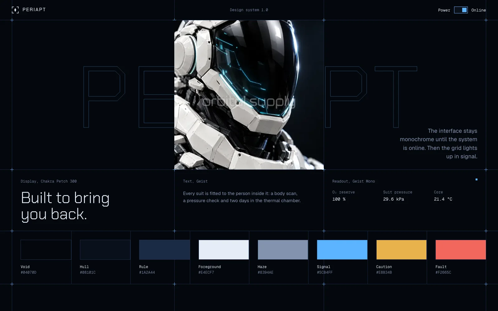
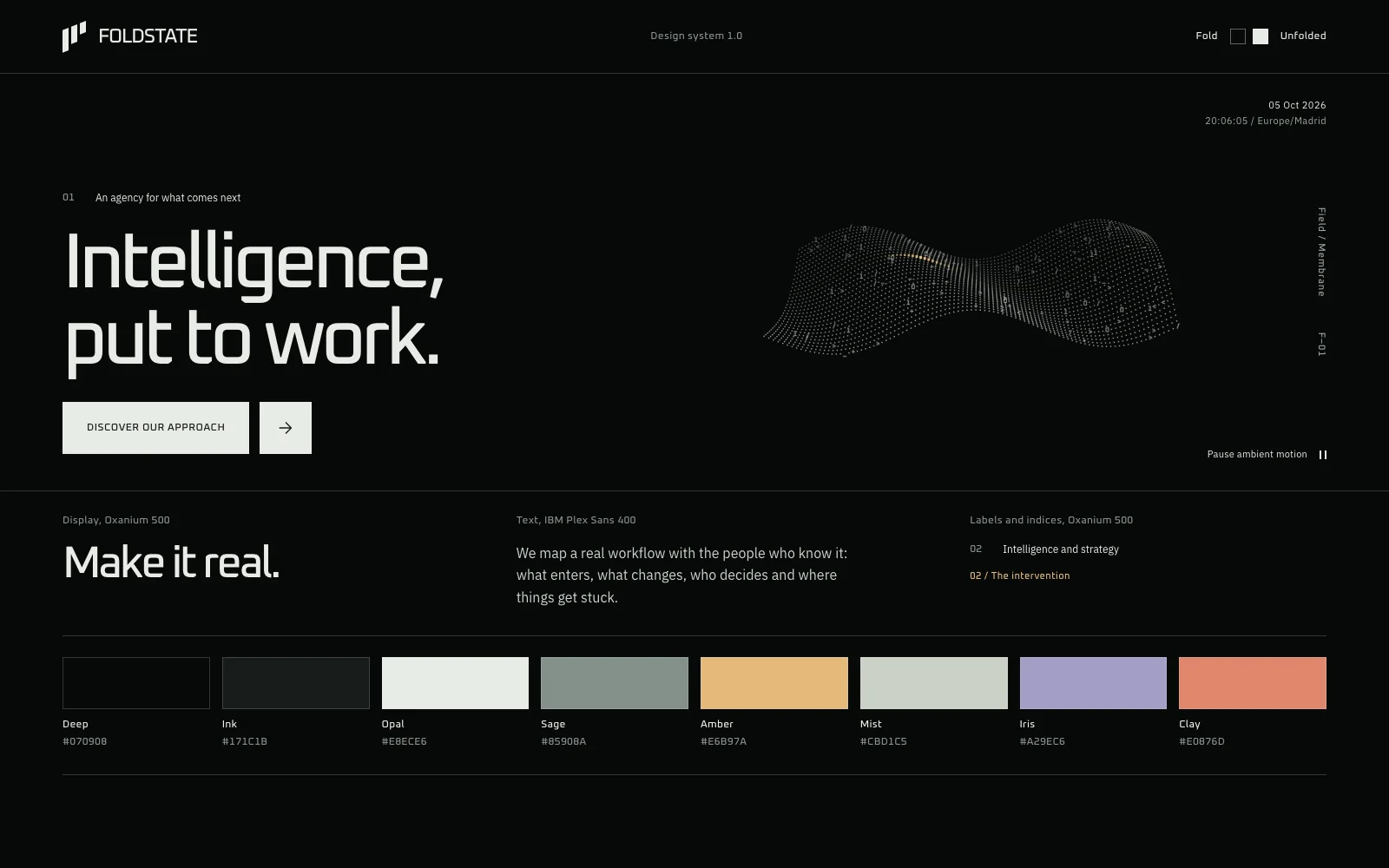
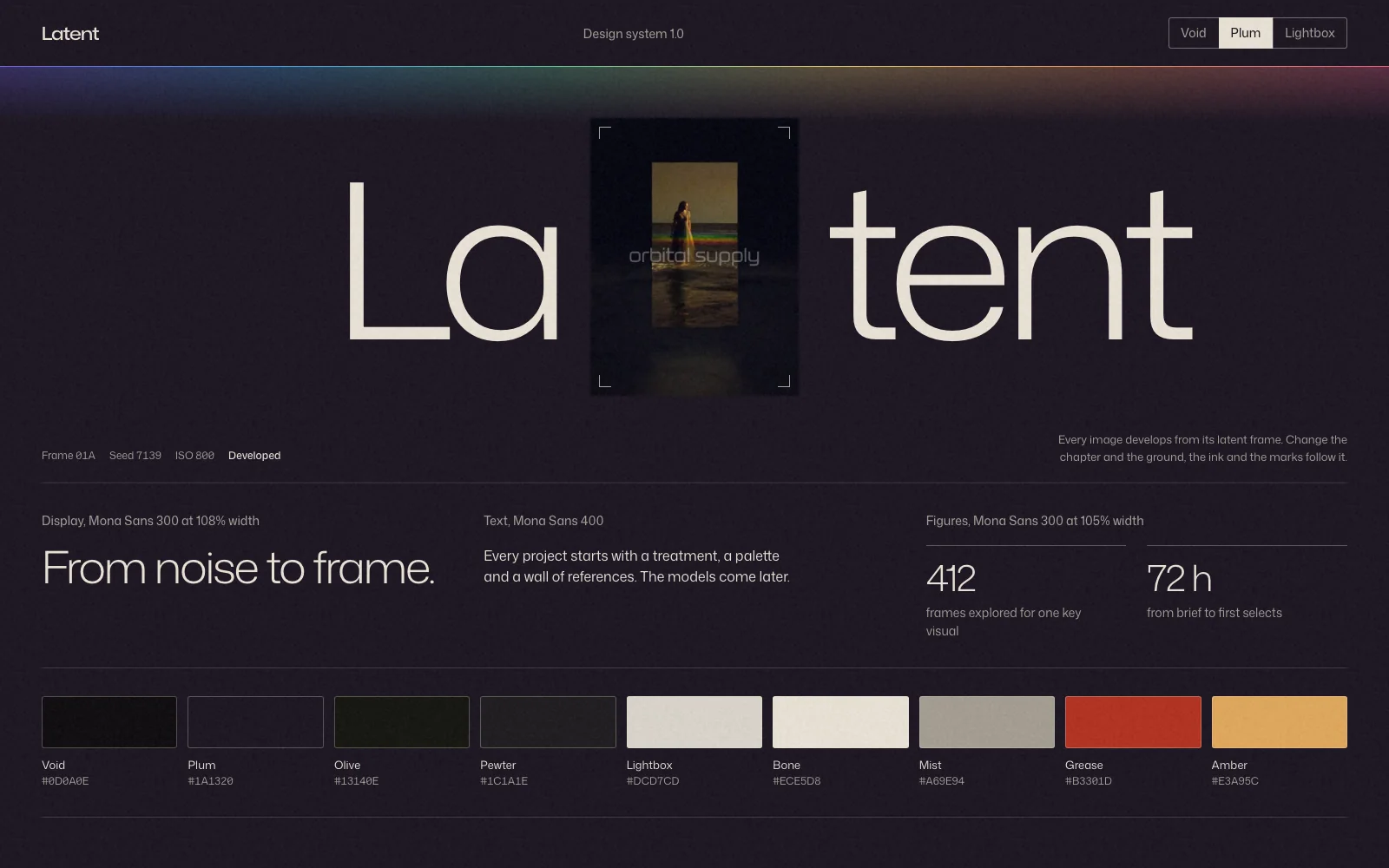
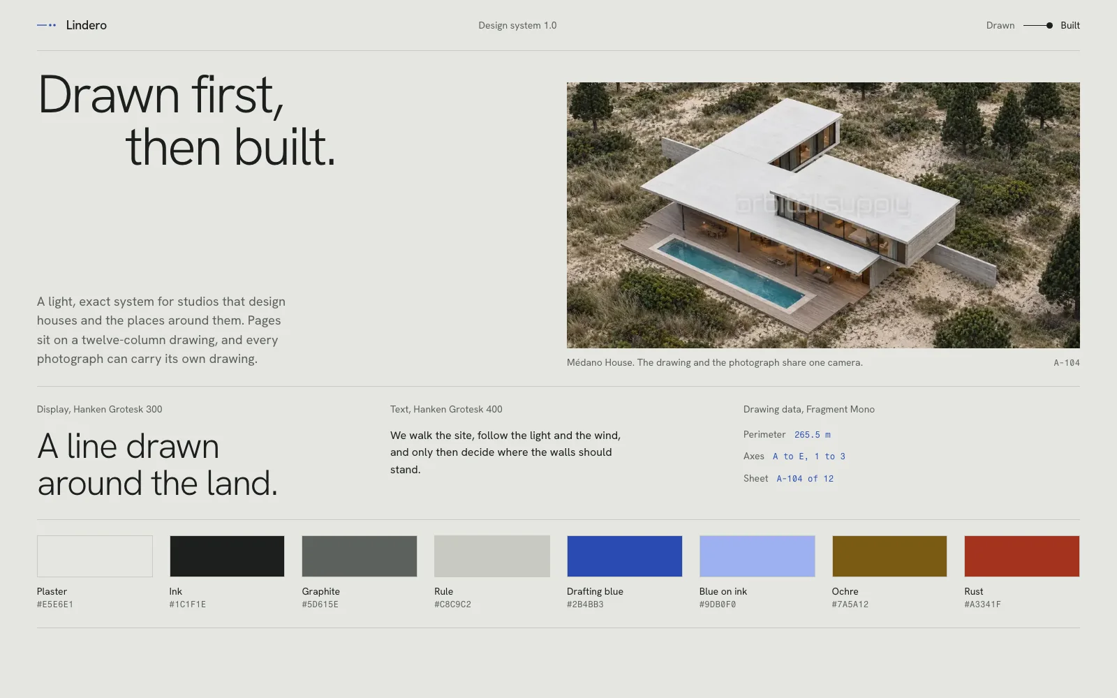
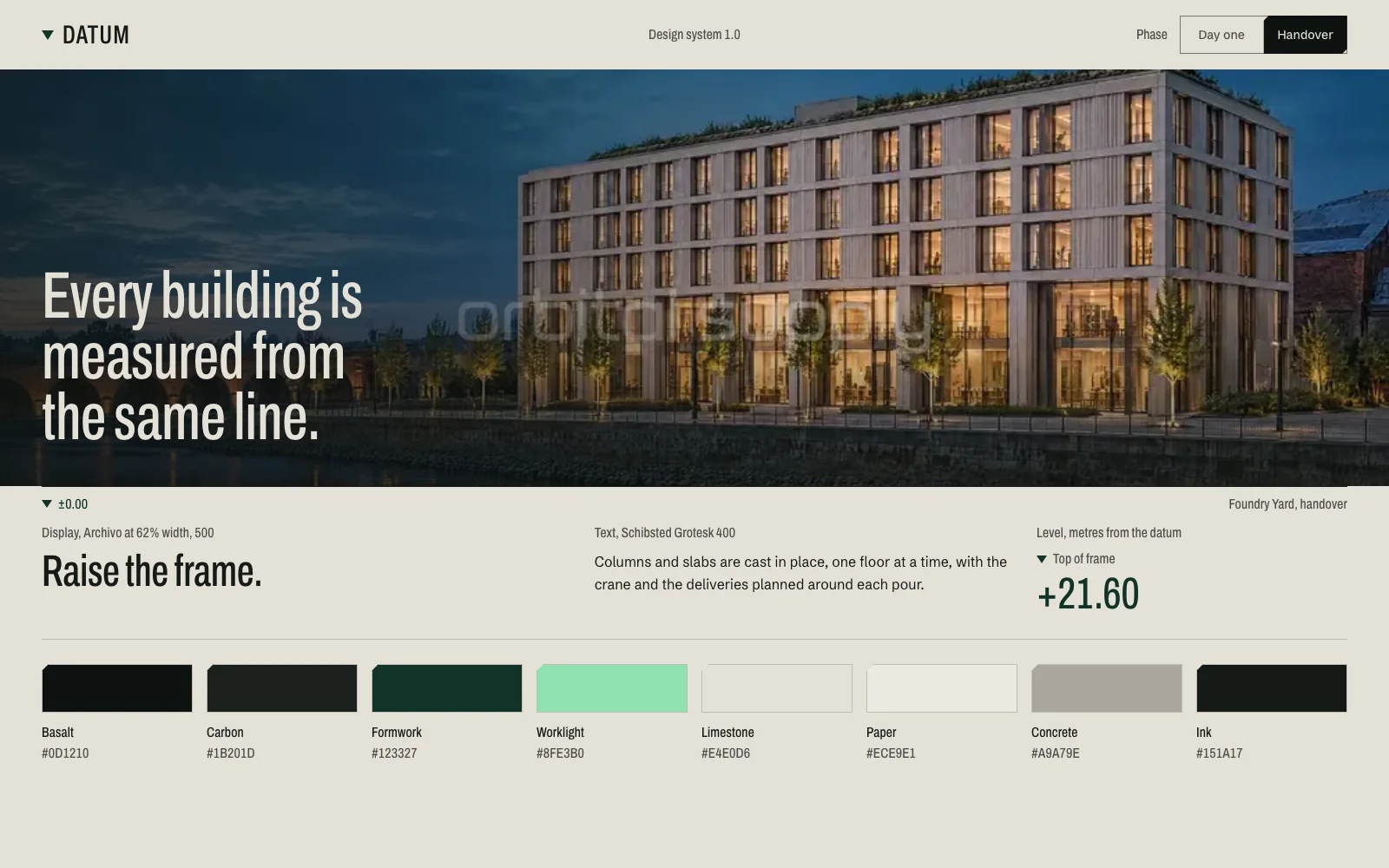
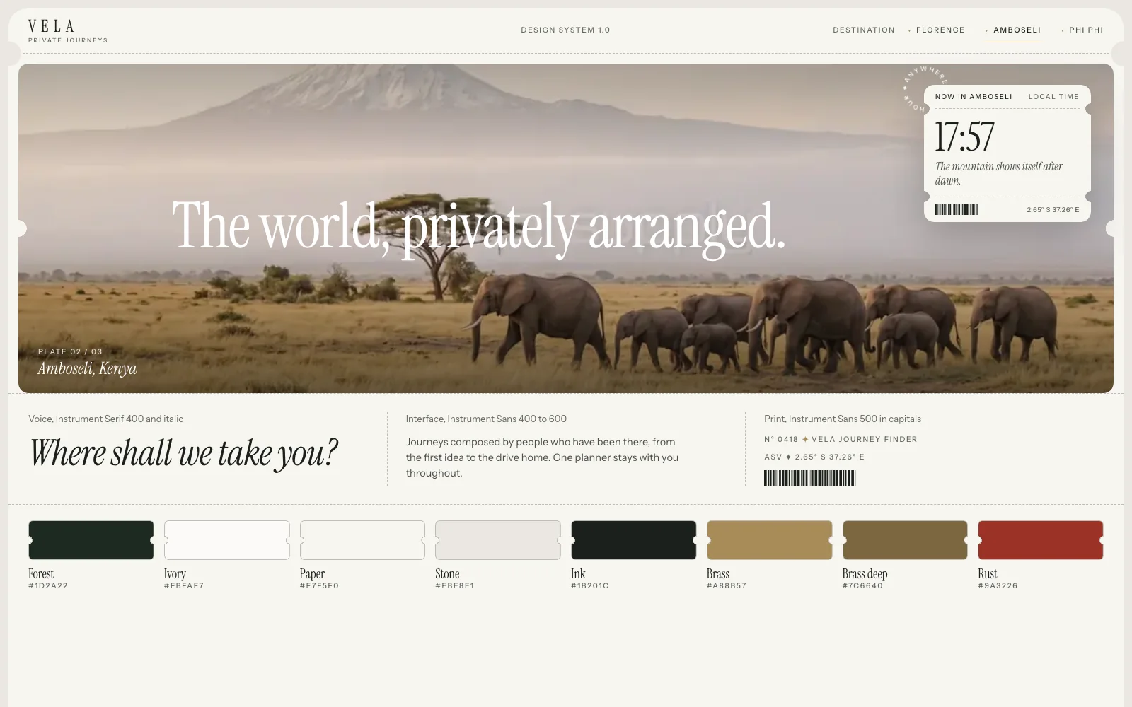
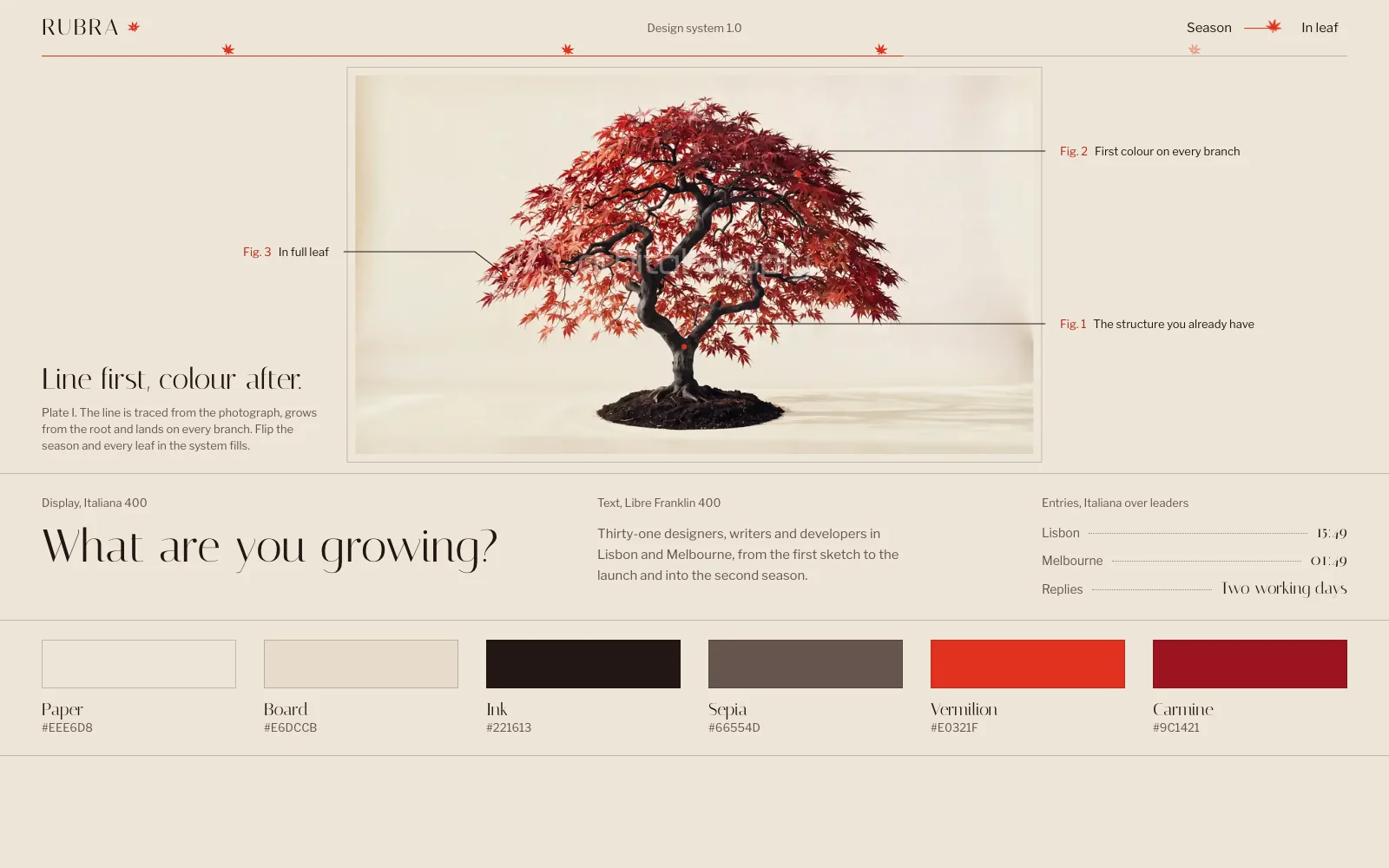
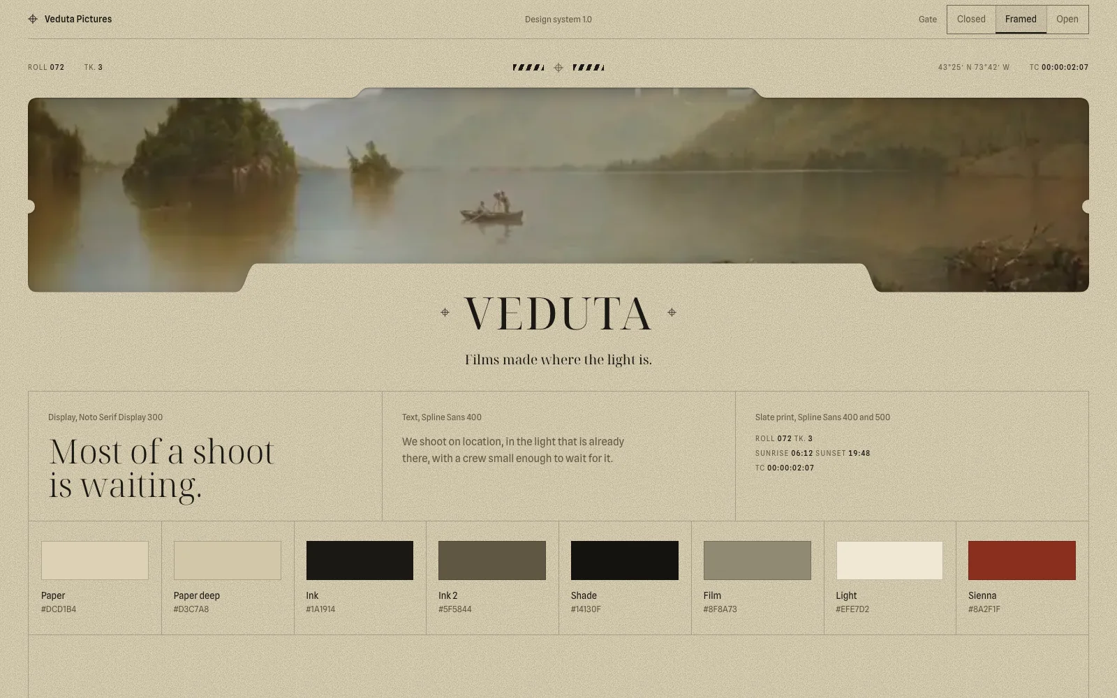
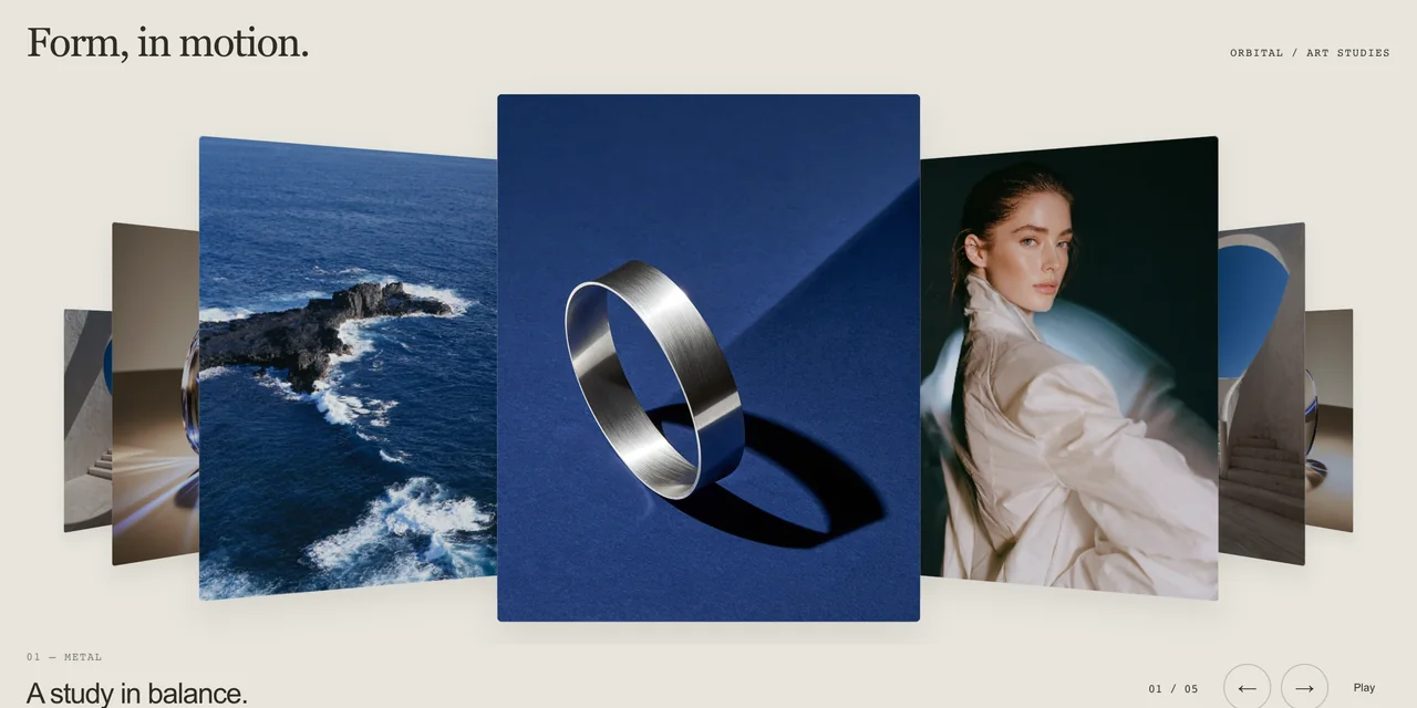
I sell website templates built with AI coding tools, Claude among them, so I’m not neutral here. You can compare the generated dental clinic above with Nácar, or the generated gym with GRIT, and judge for yourself. The difference I’d point to is an approved direction, purpose-made assets and a person reviewing the result.
What this test doesn’t show
This test shows what an empty brief returns from two Claude models on one day, and nothing more. Keep these limits in mind:
- One run each. With more runs per business, some counts would move.
- One tool. I didn’t test Lovable, v0, Bolt or Cursor, which add their own defaults. That comparison is the next test I want to run.
- A short prompt on purpose. A detailed prompt, a skill or a design file would change the results.
- Measured by script. My script counts structure, not quality. Some of these pages are perfectly pleasant, and looking alike isn’t the same as looking bad. For a quick internal page, it may not matter at all.
The data is public. The CSV and the JSON have one row per site, with a link to its first screen. The notes define each column, and the run and measuring scripts (1, 2) let you repeat it. I’m not publishing the 24 HTML files, because they carry invented contact details, some at domains that may belong to someone. Running the prompt gives you your own set.
Correction, 6 November. The first version said 21 sites used no image file and that 21 highlighted one word. Counting CSS background photos, 20 sites use no image, and many of the 21 highlight a phrase, not one word.
Verdict. In this test, the generic look is what an empty brief returned. Changing the model changed which defaults came back, and I’d expect banning a colour to do the same. Making the decisions yourself is what I’d do about it.
Questions
Short answers to what usually comes up next.
Why do all AI-generated websites look the same?
In my test, because a short request leaves nearly every decision open, and the tool fills each one with its most likely answer. 21 of 24 sites highlighted part of the headline and all 24 used rows of equal blocks, across 12 different businesses. I only tested Claude Code.
How do I make a website not look AI-generated?
Decide what the tool would otherwise decide. Choose the structure of each section, the typefaces, one way of moving and a signature element, and supply real images and real figures. Approve that direction before anything gets built.
Why do AI websites use purple gradients?
Purple on dark is a common default for software products, and it still shows up.
Do newer AI models avoid the generic look?
Not the two I tested. Opus 5.5 used more serif headlines, but all 12 of its sites highlighted part of the headline and all 12 faded content in on scroll. Its look was different from Sonnet 5.5's, and just as repeatable. I didn't compare them with older models.
Can Claude build a website that doesn't look generic?
Yes, when it gets decisions to follow. The templates I sell at Orbital Supply were built with AI coding tools, Claude among them, starting from an approved art direction, purpose-made images and video, and a review by eye. That's my own work, so judge it for yourself.
Was this test scientific?
It was a small measurement. I ran one tool, two Claude models, 12 businesses and one run each, on 5 November 2026, with a deliberately short prompt. The data and scripts are public. It shows what an empty brief returns from these models. It doesn't rank tools or predict what a detailed prompt would do.
Skip the blank page
Start from a finished website.
Each template is a tested prompt with its code, assets and motion.Keep reading
All articles
Nine bugs that break animated websites built with AI, and how to fix them
Each of these reached a build of ours. None of them throws an error, which is why they survive until someone looks at the page.
How to write a website prompt that builds the whole site
The six parts a complete website prompt needs, measured across 62 prompts from our catalogue.